I recently came across this (old but interesting) article on creating preview handlers for Vista.
If you have the preview pane showing, you can select a file in Explorer and see a preview of the contents. It is also used for email attachments in Outlook 2007.
This article explains how to use it to create a fast PDF preview based on Foxit, and another for previewing C# source with pretty formatting.
It occurred to me that I rarely see the preview pane in Explorer. It’s not enabled by default. So how do you enable it?
Explorer in Vista has a curious user interface. There are some handy features like favorite links, but adding links to this list is not particularly intuitive. Try drag-and-drop, or right-click the Favorite Links panel and choose Open Favorite Links folder. No, it’s not under Organize, where you would expect.
But I digress. In its default state, Explorer has a toolbar with two menus, Organize and Views. Other menus appear on a semi-random basis according to some broken algorithm which is meant to respond to the context.
If you dislike the capricious toolbar, you can show an old-fashioned menu bar, with top-level entries for File, Edit, View, Tools and Help. That is what I normally use.
Now you might expect that the option to show a preview would be under the Views option on the toolbar, and on the View menu on the menu bar. It’s part of the view, right?
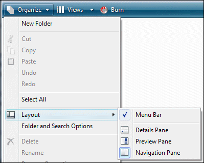
Wrong. To get the preview pane to show, you need to select it under Organize and then the Layout sub-menu. It’s not in the menu bar at all.
Since it is on a sub-menu, it is not surprising that people don’t find it.
Further, I don’t get what concept Organize is meant to represent. It’s helpful to distinguish between things that change the view, like the preview pane or folder options, and things that change the files, like New Folder or Cut. So why is stuff in both categories on this single menu? Who would click Organize to find Delete? Alternatively, if Organize is about modifying files, what is Layout doing there?
Once you have found the preview pane, it’s probably best to turn it off most of the time. The problem is that when you select a Word document, for example, most of Word has to load in the background before it displays…slow. Still, if you have a bunch of Word documents with obscure names, and want to find out quickly what they contain, then the preview pane is really useful.
I hope a faster, more logical and more intuitive Explorer is high on the to-do list for Windows 7.
Tim, it is great that you discovered one of the hidden gems of Windows Vista (I recorded a screencast on writing preview handlers 7 months ago), which I agree they hid pretty well 🙂
I have this feature ON all the time and do note that besides preview handlers working in Outlook and explorer, it works very well in the new Common File Dialog (how many times have you opened a file only to realise it is not the right one and then had to close &invoke the Open File Dialog again 😉 as you’d expect since it is effectively still the shell.
I thought it was a neat feature at first, but I now run with it off and generally consider it a bad implementation of a good idea. Here is why:
1. Maybe the fault lies with the preview handler framework or just the particular implementation, but the C# handler I used kept the file locked until that Explorer Window was closed. This means that if I used the previewer to find the right C# or SQL file, I could not edit that file until closing the Explorer window.
2. I didn’t need it that often to dedicate a portion of my screen to the preview pane. Firstly, not all files can be previewed. Secondly, not all files need to be previewed. I much prefer the Quick View feature introduced to Mac OS X in Leopard where the user hits the spacebar to explicitly invoke a transparent overlay that displays the QuickView/Preview information. Imagine that: someone using transparency in the middle of a window so as to maintain context with the users task (navigating files and asking for detailed information) rather than using transparency literally at the content’s border like Aero does. Don’t get me wrong: I run Aero all the time, but I appreciate the use of transparency in OS X because (I think) it serves a purpose in addition to chrome.