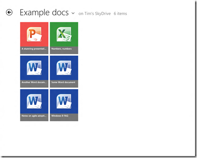
This is the SkyDrive Metro-style app running on my 1280 x 1024 desktop, in its default view. Note that each icon is 185 x 211 px. The actual title of each document is in relatively small text though still readable.
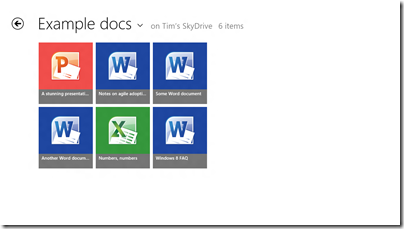
On my slate I only get two rows per screen:
You can set it to Detail view which gives nine rows on the desktop display and six rows on the slate.
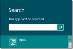
Touch-friendly, undoubtedly, but is this really best-practice design? What if you have lots of documents in a folder? I suppose it is just swipe-swipe-swipe, not helped by the fact that the SkyDrive app cannot be searched:
nor is there any way that I can see to sort the documents, say by last modified.
Of course you can do all these things in the touch-hostile desktop application.
Both the app and Windows 8 itself are pre-release so may improve, but I would like to see a smarter approach to browsing and selecting documents in Windows 8 Metro-style.
For more on Windows 8, see my review on The Register.


I’ve played around with Windows 8 Release Preview for a while, and even tried to get some regular work done with it too. Seems that the Metro UI appears an attractive prospect but you need the mature option of the desktop for a satisfying experience. The schizophrenic nature of this OS seems to be the very antithesis of efficiency as I am spending more time driving it than being productive. Yet there is a “but”. But, I do like the simplicity of the Metro UI and see its relevance for the tablet devices where browser and chat are paramount. It may yet prove to be all things to all users.