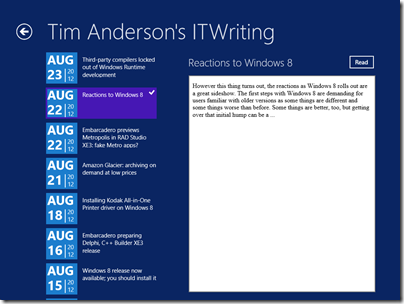
What would it take to create a Windows 8 Modern UI content reader for this site? Just for fun, I built a simple one; or rather, I slightly adapted Microsoft’s Metro style blog reader tutorial.
The app only has four screens (or pages) but despite its simplicity I found the tutorial somewhat fiddly. Getting the data from the WordPress RSS feed is simple, thanks to the Windows.Web.Syndication namespace which is part of .NET Framework 4.5. Most of the work is in the user interface, which means switching between XAML and C#. Of course as a developer I would rather work in C#.
Further, the Visual Studio editor for C# is better than the editor for XAML. In C# I can easily navigate the code using Go to Definition, Find all References, and so on. In XAML it takes longer to find things like referenced styles and resources. Plus XAML is XML, which I find harder to read than an elegant language like C#. Even commenting out a line is more hassle in XML.
I did not like the colours used by the tutorial for the list of posts in SplitePage.xaml. It took me a while to work out what to change. Was the colour defined in a resource, or in a template, or in a style, or directly coded as an attribute of the relevant TextBlock object?
Of course you can open the XAML in Blend if you prefer, the designer-oriented tool that comes with Visual Studio 2012. Blend is more complex than the Visual Studio XAML editor, but may be better once you have figured out how it works.
The amount of work involved in making your app well-behaved is proportionately larger if your app is essentially very simple. You have to deal with different layouts for different screen sizes and orientation, as well as the small Snapped layout. You also have to consider what happens if your app is suspended and resumed.
The above means that despite the apparent simplicity of a Modern UI interface, with its chunky buttons, there is more to consider than with, say, a Windows Forms application whose window is never rotated and over which you have full control.
Still, I was pleased with my app which has reasonable functionality based on a small amount of work.
Visual Studio 2012 is impressive, though I did experience some screen corruption after switching back and forth between the Metro and Visual Studio environments for debugging. Restarting Visual Studio fixes it. Using the simulator seems more robust in this respect.
The App Bar
One thing though. If you squint at the above screenshot, you will see that I have put a Read button to the right of the post title. Clicking or tapping this opens the post in a embedded web browser view that is nearly full-screen. However, this Read button is not included in the tutorial, which says:
On the split page, we must provide a way for the user to go to the detail view of the blog post. We could put a button somewhere on the page, but that would distract from the core app experience, which is reading. Instead, we put the button in an app bar that’s hidden until the user needs it.
This may in fact be an excuse to include an App Bar in the tutorial; but I disagree with it. With the App Bar, the user has to right-click or swipe down to display the App Bar, and then click or tap the View Web Page button.
That is two actions rather than one. Is it really better than having a small button in the UI?
It seems to me that tucking things into the App Bar is fine in cases where there is real merit in an immersive experience, such as in the web browser, but less compelling when you already have a screen with a back button and a scrollable list. I was also concerned that users might not realise they needed to display the App Bar in order to use the app properly.
Let the design debate continue.
Design-centric
Microsoft’s Modern UI continues a trend which began with Windows Presentation Foundation (the first incarnation of XAML), which is to make a platform richer for UI designers and more challenging for developers who lack design skills. Nothing wrong with that; but if you remember how easy it was to snap together an app in Visual Basic 3.0, you may feel that something has been lost.
I guess that recognition of that fact was one of the motivations behind Visual Studio LightSwitch, in which you define the data and business rules, but the screens are generated for you. LightSwitch has complexities of its own though.


Interesting.
Certainly Modern UI, having fully-accelerated graphics, would be more to trigger edge cases in the graphics drivers. Visual Studio would also tend to suffer, as the editor has been GPU-accelerated since it was rewritten in WPF in 2010.
I’m not convinced the graphics card vendors have their act together yet, when it comes to drivers. I’ve been seeing more graphics glitches recently, as programs change over from GDI to accelerated graphics. They’ve just been chasing performance for so long that general stability has suffered.
The simulator is actually running on the same Windows 8 instance — which is why it’s called a simulator, and not an emulator. However, it starts up another user session and connects to it via RDP — which isolates it somewhat from the rest of the system.
I think that I almost agree with your concerns regarding the Metro UX. Personally, I believe that MS has taken the “Metro-ification” a little too far.
For something like an ebook reader, a totally immersive UI makes sense. The usual actions in such an application, flipping to the next or previous page, do not require that the accessory UI elements be constantly visible.
However, I’m not so sure about this in the case of the web browser. UI elements like the home, back and forward buttons, favorites and the address bar are used much more frequently than the equivalents in the ebook app. Hiding them by default might actually degrade the user experience, as you are hinting at.
What about LOB applications?
The problem is that Metro is as much a philosophy as a technology. The Metro philosophy seems to, at least to me, only cover a subset of possible usage cases. The result might well be a confusing mish-mash of interpretations of the Metro philosophy.
Perhaps, with reference to the Einsteinian proverb (“Make things as simple as possible…), Metro has made things too simple?