Rhys Bowen: A love story for Venice

image

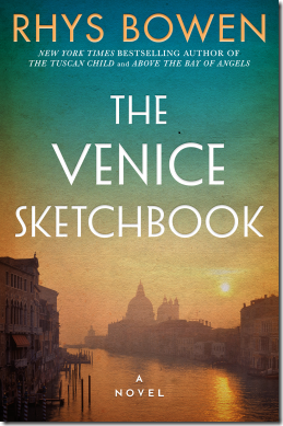
I loved this book; if anything it is too short. It begins with Lettie, a young English girl, and her visit to Venice in 1928, accompanied by her prim and stuffy aunt, who is determined to protect her charge from anything modern or lively, and especially from interacting with strangers. Needless to say the delightfully named Aunt Hortensia’s does not altogether succeed in her endeavours and Lettie forms a brief but life-changing connection with a Venetian, leading us into a story that spans the decades, as we jump to the modern day and follow the story of Caroline, who is charged by her great aunt Lettie to visit Venice to uncover … something.

This is an easy and compelling read which I finished in one sitting. The bulk of the book concerns Lettie and her time in Venice as Europe was plunged into the tragedy of the second world war. The war is mostly at a distance but casts a shadow over everything, and author Rhys Bowen recounts some dark moments.

Reflecting on the book I am struck by how Bowen transports us to Venice, the city and its people, which in many ways is the heart of the story. She has obvious affection for this unique and wonderful place, its delicious food (if you know where to go), its beautiful works of art, its addiction to religion, and even its less savoury aspects, smells, frequent rain, and occasional “acqua alta” when the city is flooded.

The charm of the ancient and magical city more than makes up for what are perhaps slightly thin (though still likeable) characters. The only negative for me is that the ending was a little abrupt; I would have liked a little more detail about the aftermath.

No complaints though; I reviewed this book on a drab November day in lockdown and spending a few hours in Venice was a most welcome and enjoyable respite.

A Venice Sketchbook is published by Lake Union Publishing on 13th April 2021.
A UI lesson: do not ask users to choose between Register and Login

I am developing a web site for playing bridge, a project which kicked off in March when lockdown caused bridge clubs everywhere to close. There are lots of sites where you can play bridge online, but not many options (particularly back in March) for clubs that wanted to run their own online sessions.

It’s going OK with a number of clubs now using it every week, though it is still in development. I have learned a painful lesson though. In order to proceed as quickly as possible, I started my project with the Visual Studio template for an ASP.Net Core application with ASP.NET Core Identity – the latter an easy decision since it handles all the complications of registration, password reset and so on. (I did end up having to re-plumb it to use int rather than GUID for the primary key but that is another story).

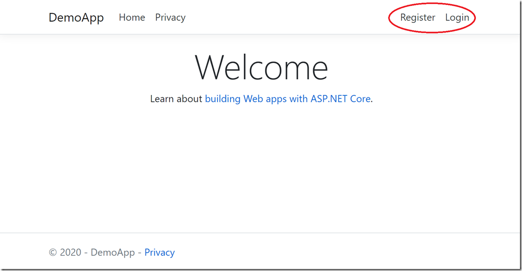
The default home page the template generates looks like this, with options in the menu to Register or Login.

image

Registration and login are fundamental concepts that have been part of the web forever. It’s simple for a developer to understand: you register to create an account, you login if you already have an account.

The painful discovery is that this is not obvious to everyone, particularly to an older demographic that did not grow up with computers. Another factor is that cookies, browser-saved passwords and single sign-on with Google/Facebook etc means that this whole area is a bit of a mess and there are people who just kinda expect web sites to know who they are (which in one way horrifies me but I do see the massive convenience).

The consequence is that a surprising (to me) number of people had difficulty knowing whether Registration or Login was what they needed. They would Register, then return to the site and hit Register again. Why is this site asking for my details again? Maybe a security thing? Oh no, why does it now say username not available?

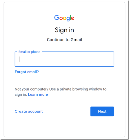
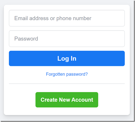
This is because asking the user to make this choice is not good design. Registration is rare, login is common. Further, Register is a confusing word. We sometimes use the word register when accounts already exist. Create Account is better. And a better UI is just Login. I need to access this website. Then, underneath the username/password request, an option that says “I need to create an account”. The two options should not be equally prominent; and if you look at how many prominent sites design this, that is what they do:

image image

Lesson learned; but I wish this had occurred to me sooner!