Android up, Apple down, Microsoft so near, so far: 2012 in review

What happened in 2012?

Windows 8

Whether you regard it as the beginning of the end for Windows, or a moment of rebirth, for me it was the year of Windows 8. Microsoft’s new Windows is fascinating on several levels: as a bold strategic move to make a desktop operating system into a tablet operating system, or as an experiment in how much change you can make in an established product without alienating too many of your customers, or as the first mainstream attempt to create an “immersive” user interface where users engage solely with the content and have to make an effort to summon menus and tools.

The context is also gripping. Microsoft’s desktop monopoly is under attack from all sides. Apple iPad and Google Android tablets, cloud apps that make the desktop operating system irrelevant, Mac OSX computers and laptops that have captured the hearts of designers and power users. Windows still dominates in business computing, but the signs of encroachment are there as well, with reports of iPad deployments and a shift in focus away from desktop apps.

Windows 8 is intended as the fix, making Windows into a first-class tablet operating system and establishing a new app ecosystem based on the Windows Runtime and the Windows Store.

How is it going so far? Not too well. App developers have not flocked to the platform. Users who were happy with Windows 7 have been bewildered. Most seriously, the Windows ecosystem of OEM vendors and general retailers has failed to adjust to the concept of Windows as a tablet operating system, treating it more as a somewhat awkward upgrade to Windows 7.

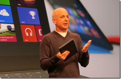
The work of Windows President Steven Sinofksy in overseeing the engineering and design of Windows 8 and delivering it on schedule has been amazing. He kept his team focused and shipped a release of Windows that is faster and with nice improvements on the desktop side, as well as offering a tablet personality designed for touch-first, in which apps are securely sandboxed and easily installed from an online store.

At the same time, it is easy to see ways in which Microsoft bungled Windows 8.

  • Why was Microsoft so unrelenting with its “immersive” UI that it would not tolerate an option to show things like time and battery status on screen all the time, or three dots for “more” so that users will more easily discover the app bar, as suggested by Paul Thurrott?
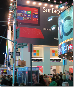
  • Why did Microsoft spend mind-stretching amounts on advertising for Windows 8 and for Surface RT tablets, but not allocate enough budget to create a decent Windows 8 Mail app, for example? The current effort is a constant annoyance, especially on the Surface where there is no alternative.
  • Why did Microsoft expend so much effort pumping up the number of apps in its Store, but so little effort nurturing quality? Very few outstanding apps were available at launch, and even now they are hard to find.

I say this as as someone who likes Windows 8 overall. The strategy makes sense to me, but the execution in some critical areas has been disappointing. So near but so far.


image

The sudden departure of Sinofsky immediately after the Windows 8 launch was unfortunate; a significant loss of a person with both vision and the ability to implement it.

That said, despite all the difficulties Microsoft has now launched this radically different version of Windows; it is over the first hump and provided that the company keeps its nerve, it can focus on refining the platform and creating compelling new apps that will persuade users to explore it. Further, users who have the patience to learn a few new ways to navigate Windows will discover that it is a decent upgrade, with strong features like Hyper-V, improved file operations, Windows to Go and more.

It is tablets that matter though. Tablet usage will continue to grow, and if Microsoft cannot establish Windows as a tablet platform, its further decline is inevitable.

Does CEO Steve Ballmer have a grip on this huge, dysfunctional, brilliant, frustrating company? Maybe 2013 will answer that question definitively.

image 

Surface RT

2012 also saw the launch of Microsoft’s first own-brand tablet. It is high quality, exceptionally strong, with long battery life thanks to its ARM processor and supported by keyboard covers that let you flip it between touch and keyboard/trackpad without making the device too bulky or complex.

image

Three things, no make that four things, have prevented Surface RT from taking off as Microsoft hoped:

1. Performance is barely adequate. It is usable, but Office is sluggish with large documents and apps are noticeably less responsive than on x86 Windows 8. That said, the NVIDIA Tegra 3 chipset is capable of fast graphics, and some games run surprisingly well, so it is not all bad.

2. The lack of strong apps affects Windows RT devices like Surface more than x86 Windows 8, since you cannot install desktop apps. Yes, it is a new platform, but Microsoft could have done better.

3. There is too much desktop in Windows RT and therefore in Surface RT, making the device more complex than it should be.

4. Microsoft has not yet established Windows 8 as a tablet platform in public perception, nor yet provided the apps that make it work fully as a tablet platform. One consequence is that when someone goes out to buy a tablet, they do not think of Surface RT as a candidate; it is iPad or Android. Another consequence is that reviewers tend to evaluate Surface RT as Windows rather than as a tablet. Considered as Windows, it is weak compared to x86 builds.

Despite all the above, I often slip Surface RT into my bag when travelling. The combination of small size, keyboard cover, long battery life, and Word and Excel is a winner for me. Surface RT 2, with faster performance and a more mature app platform could be great, if the product makes it to a second edition.

Apple: a bad year

2012 was a bad year for Apple. On one level everything is fine, with iPads and iPhones selling like fury, and the successful launch of iPad Mini. What changed though is that the concern of the late Steve Jobs, that Android is close enough to iOS to capture a lot of its market, became a reality. Android is the bestselling smartphone platform and Android tablets, led by Google Nexus and Samsung Galaxy, will likely overtake iPad for the same reasons: better value, more vendors, faster innovation. There was plenty of litigation in 2012 as Apple sought to protect its inventions, but despite some legal successes, Android has continued to grow and it looks unlikely that court action will do much to impede it. Another problem for Apple is that price pressure makes it difficult to sustain the high hardware margins which have made the company so profitable.

The other Microsoft

The Windows 8 drama caught our attention, but Microsoft has been busy elsewhere, generally with better success. The most significant development was the transformation of the cloud platform, Windows Azure from an also-ran to a compelling contender (though still small relative to Amazon), thanks to the addition of IaaS (infrastructure as a service), or plain old Windows VMs, along with a new management portal that makes the service easier to use.

Microsoft also released Server 2012, a substantial upgrade to Windows Server particularly in Hyper-V, but also in storage, remote access, server management, and general modularisation.

Windows Phone had a mixed year, with a sage in sales when Microsoft announced that Windows Phone 7 devices will not be upgradeable to Windows Phone 8, but ending more positively with relatively strong (in the context of a market dominated by iOS and Android) sales for new Windows Phone 8 devices.

image

It was a good year for Office 365, on-demand Exchange and SharePoint, which is now an obvious choice for small businesses migrating from Small Business Server and a plausible choice for medium and larger businesses too.

2012 also saw the launch of Office 2013. I am not so sure about this one. It is meant to be the version of Office that is touch-friendly and cloud-centric. It is not too bad, but with its washed-out appearance and various annoyances it hardly seems a compelling upgrade. Office needs a “Windows 7” release, one where Microsoft focuses on what Office users find slow and/or irritating and sets out to fix the issues.

Adobe’s cloud and HTML transformation

Microsoft took too much of my attention in 2012, something I hope will change in 2013, but one company which caught my attention was Adobe. Without great fanfare, it has successfully switched the business model for the Creative Suite (PhotoShop, Premiere, Dreamweaver and so on) which forms the largest part of its business to a subscription-based model with cloud delivery and additional cloud services. It has also moved its technical platform away from Flash and towards HTML with less pain that I had expected, and is coming up with interesting new tools in its Edge range. Most impressive.

RIM and Blackberry: all to prove in 2013

2012 was painful for RIM, which saw interest in its Blackberry platform decline to the point where many now consider it of little relevance in mobile, but mitigated by intense effort to engage its developer community in preparation for the launch of Blackberry 10 devices at the end of January 2013. It may be too late; but the new OS does have attractions, especially in business where there is innovation in the way it separates business and personal use of a single device. Is Windows Phone or Blackberry 10 the third mobile platform after iOS and Android, or will these two stragglers simply weaken each other while Apple and Google dominate?

Amazon web services: fast pace of innovation

Amazon dominates the IaaS market and with good reason: relatively low prices, high quality of service, and fast pace of innovation. It was this last that most impressed me when I attended an update last November. Amazon prefers to talk to developers and businesses rather than the press, and its services are perhaps under-reported relative to its competitors. An impressive operation, with an inspiring CEO.

Google the winner in 2012

It may not have vanquished Facebook, but of all the tech giants Google has had the best year, with sustained success in search and advertising, huge Android sales and the establishment of the operating system on tablets as well as smartphones, thanks to Samsung and Google’s own efforts with the Nexus range. Google also won some kudos versus Apple following the iOS 5 maps debacle, with Apple’s own mapping efforts found wanting.

Not everything has worked for Google, yet. The web-centric Chromebooks are out there, but whether there is much appetite for netbooks that run everything in the browser is an open question; there are security advantages to this computing model, but users would rather have Android with its rich app ecosystem and greater freedom.

How will Google monetize Android, in the face of further fragmentation and a competitor like Amazon helping itself to what is free but building its own commercial platform on top? Another open question, though my guess is that Google will find a way.

Google rationalised its services in 2012 and pushed hard on its social platform, Google+, but failed to make much dent on Facebook’s popularity.

At the end of 2012 we were reminded of the downside of reliance on cloud providers when Google pulled Exchange ActiveSync support from its free email service. Existing users are not affected, but new users will find it harder to set up Gmail accounts on devices such as Windows Phones. Free users can hardly complain, but if they have become reliant on a gmail address there is an element of lock-in which Google is now using to discourage users from using a competitor’s mobile device.

2013?

A few predictions. More Microsoft fireworks as the PC and laptop market continues to decline; Apple vs Android wars; a strong play from Google for the Office/Exchange/SharePoint market. What else? If the past is anything to go by, expect some surprises.

Async USB audio streaming at 24-bit 192Khz with Logitech Squeezebox Touch

The discontinued Logitech Squeezebox Touch is a fine product for multi-room audio streaming, though sadly discontinued. The Touch is limited to a maximum audio resolution of 24-bit and 96Khz – or is it? While this is true of the internal DAC (Digital to Analogue Converter), an audio enthusiast known as Triode set about modifying the firmware to output higher resolutions.

Another aspect of his work was to enable use of the USB port on the Touch, which was originally designed for attaching storage, to support an asynchronous USB DAC. The idea of async USB audio is that the clock which controls the decoding is in the DAC and independent of the source. There is an explanation by Vincent Kars here:

In this mode an external clock is used to clock the data out of the buffer and a feedback stream is setup to tell the host how much data to send.

A control circuit monitors the status of the buffer and tells the host to increase the amount of data if the buffer is getting too empty or to decrease if it’s getting too full.
Since the readout clock is not dependent on anything going on with the bus, it can be fed directly from a low jitter oscillator, no PLL need apply.

Is async USB audio really necessary? Is any resolution above 16/44 necessary for playback? I am sceptical, but after getting hold of a Teac UD-H01 which supports both async USB and resolutions up to 24/192 I thought it would be fun to try it. 

image

I followed the steps here which worked perfectly. They involve installing a Squeezebox app called Enhanced Digital Output, and installing a modified Linux kernel (the Touch runs Linux). The modifications are reversible, which is reassuring.

I then tried one of the the few Flac-encoded music files I have in 24/192 format. I still cannot tell you whether either the format or the asynchronous aspect makes a difference; but I can say that the sound is exceptionally good, though it also sounds excellent with well-mastered 16/44 sources.

Subjectively it improves on the internal DAC in the Touch, with deeper bass, a more spacious sound, better separation between instruments, more natural vocals, and all the usual hi-fi clichés.

Leaving that aside though, kudos to Triode for his achievement.

Fresh Paint Windows Store app: in equal parts great and frustrating

Now that the initial shock of “where is the Start menu” is wearing off, some of the real issues and points of interest in Windows 8 are coming to the surface (ha!), one of which is what a good Windows Store (also known as Metro) app is meant to look like. Microsoft has not been helped by the fact that most apps in the Store are either simplistic, or poor quality, or both.

In this respect Fresh Paint is worth a look, since it comes from Microsoft and is the outcome of considerable work and research. There is a post about the history of the app on Steve Clayton’s blog which is good reading.

The title cleverly combines the sense of a new approach to Paint, the Windows app from way back, with the fact that this is a simulation of paint (the liquid stuff). I have not found much in the way of documentation, though there is a FAQ here, but even a few moments playing shows that this is a sophisticated painting tool, especially on a tablet where you can paint with a finger or stylus. It works on both x86 and ARM devices such as Surface RT though performance is laggy compared to that on a modern x86 PC, and the pencil and pastel tools are missing.

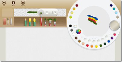
This is an example of immersive UI. While painting, few tools are visible. As a concession, there are five faint tools at the bottom of the screen for undo, redo, show template, centre artwork, and dry. Right-click or swipe in, and you get tools for selecting the painting tool (pencil, brush or pastel), a colour palette that really is like a palette, with the ability to mix your own colours, an eraser, a dropper tool which I have not fully figured out, and a dry paint tool that picks up wet paint from the canvas.

image

Click or tap surface and you can select the canvas type and background colour. The camera button lets you use an image as the background.

image

Paintings are saved automatically every five minutes or when you return to the home page. You can also export paintings as .PNG files.

You can zoom in and out using the mouse wheel or pinch gestures.

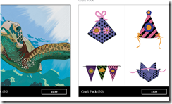
The app is free, but Microsoft offers paid-for add-in packs which provide templates. You can paint over the template, then use the template tool mentioned above to remove it from the canvas. There is a free Fun Pack to get you started.

image

This is not a replacement for the desktop Windows Paint. Features missing in Fresh Paint include selection, fill, cropping, resizing, rotation, clipboard support and printing, to name a few.

Concerning Fresh Paint, three things are obvious.

One is that this is innovative, bold, and excellent in the way it lets you paint in a manner that is much closer to the real thing than most computer graphics software.

Second, users are having real difficulty figuring it out. Some users have not worked out how to get the menus and tools showing at all, hence this is explained in the FAQ mentioned above. Others are like Terry Odell who says:

The problem I have is there’s no "help" or "right click to figure out what things do" in the app. It’s total trial and error, and perhaps if I were 5 like my grandson, I’d be able to figure it out. There are choices on the top of the screen, and more choices/icons on the bottom. The camera on the bottom opens up the ‘real’ camera on my computer, but there’s no ‘click here to take a picture’ (not to mention I have no idea what to do with one.  I’d rather see a tutorial of some sort than have to keep wading through forums to get a question answered. As for ‘dropdown’ I have no idea where that is? The top menu? The bottom menu. Windows 8 is hardly intuitive, and the apps, while great in theory, don’t have enough information provided for how to use them.

It is as if not having documentation is a point of pride, because the app should be so easy to use that documentation is not needed, and if the user does not get it, it is the user’s fault. It puzzles me, since it in a few hours the team could provide some simple documentation that would help users get the best from this app.

Third, it is not stable. I got several crashes in the course of playing around briefly to write this post.

image

Why is it crashing? There are hints that it may be to do with graphics drivers. I have the latest NVIDIA drivers and other apps and games are solid. It would be interesting to know the reason why it falls over so much, and whether this is caused by buggy app code or problems in the Windows Runtime itself. It is not just my system; take a look at the reviews in the Windows Store for more reports.

I do not mean to be snarky; in many ways this is a brilliant app both for children and for anyone with some artistic talent. It just needs a little more work, and seems to say a lot about the state of Windows 8 apps right now.

Microsoft scraps Expression Web and Design, blends Blend with Visual Studio

Microsoft is giving up its long effort to compete with Adobe in the design tools space. The Expression range of products is being discontinued, in favour of enhanced design capabilities in its developer-focused Visual Studio. Blend for Visual Studio continues, as a design tool for Windows Store apps and Windows Phone apps. A future edition of Blend for Visual Studio, currently in preview, will add WPF (Windows Presentation Foundation), Silverlight, and SketchFlow support. The release version of this upgraded edition is promised for Visual Studio 2012 Update 2.

The new product plans are announced here:

Microsoft is consolidating our lead design and development offerings — Expression and Visual Studio — to offer all of our customers a unified solution that brings together the best of Web and modern development patterns.

Expression Web, the web design tool which evolved out of FrontPage, and Expression Design, a vector drawing tool, will be discontinued completely. Microsoft’s web design tool will now be Visual Studio.

One consequence of this decision is that Expression Web 4 and Expression Design 4 are now free downloads, though unsupported.

Expression Encoder, for converting media for streaming, is also being discontinued, though Expression Encoder Pro will remain on sale throughout 2013. Microsoft says it is still investing in format conversion as part of Windows Azure Media Services.

Is this a good decision? In one sense it is a shame, since Expression Web is a decent product. At least one longstanding user of the product is disappointed:

For Microsoft, the web is dying and the future lies in Windows 8 apps. When asked what we web developers should be doing the answer was the same: Make Windows 8 apps. Which is about as useful as telling a contractor to start erecting tents instead of houses because houses are no longer relevant. Anyone outside the reach of whatever reality distorting force field they have running at the Redmond campus can see how idiotic this is, but that hasn’t stopped the people in charge for pulling the plug on one of the few applications from the company that had something new to offer.

That said, Expression Web has been available for a number of years and made little impression on the market, so how much value is there in continuing with a tool that few use, irrespective of its merits?

The decision makes sense in that Microsoft is shutting down an unsuccessful product line in order to focus on a successful one, Visual Studio.

Further, the end of Expression illustrates the difficulty Microsoft has had in attracting designers to its platform, despite high hopes in the early days of WPF and Mix conferences in Las Vegas.

Review: Skullcandy Navigator, smart on-ear headphones with microphone and special controls for Apple devices

Skullcandy has released the Navigator on-ear headphones, using some of the same technology found in the over-ear Aviator though simplified and at a lower price. An inline microphone is included, with buttons to control call answer, play, pause and volume on iOS devices.

image

The Navigator is a stylish device, with the glossy black finish on the outside of the ear cups nicely offset by sliver chrome trim and sliders. The cups fold inwards for storage and a silky drawstring bag is supplied. The cable is detachable, which is always a good thing since if you are are lucky the cable will detach when you trip over it rather than breaking internally, and if you are unlucky you can replace it.

image

In the box you get a a guide to the “MIC3” button controls and a leaflet showing how to attach the cable, along with the headphones, bag and cable itself.

The soft inside of the ear pieces has a cutaway section showing the Skullcandy logo.

image

While the designers no doubt thought this a nice touch, it looks like there is potential for the edges to lift or tear here, but only time will show whether this is a real concern.

Sound

The sound is decent but falls short of greatness, no more or less than you would expect at this price point. First impressions are good, with a smooth sound and adequate bass, but close listening revealed some compromises. The sound is a little recessed, with accentuated bass and slightly dulled treble, with the result that handclaps, for example, sound less real and natural than they should.

Listening to Sade’s By Your Side, with its strong rhythmic bass lines, is always revealing; it is on my list of difficult tracks. On an iPad this was disappointing, with the bass turning to mush and the treble detail getting lost too. Switching to a desktop PC and a dedicated headphone amplifier made a substantial improvement and the music became enjoyable, though still some distance from how it can sound with the best equipment.

Mirror in the Bathroom by the Beat (or English Beat) is a punchy and demanding track that is also good for revealing gear differences. The Navigators are claimed to have “punchy and powerful bass” but on this track they sounded too polite, losing too much of the rhythmic drive in the song, and again recessing the treble too much.

Adele’s Daydreamer sounded reasonable with forward vocals, though the Navigator loses some of the delicacy of the guitar picking and the sound is a little closed-in compared to better units.

The sound is unexceptional then; but good enough for casual use.

Having a microphone built in is great though. Plugged into Microsoft’s Surface RT tablet, this set made a great job of a Skype call with clear, solid sound at both ends of the call.

Controls

The Navigator’s inline microphone includes controls for use with iOS.

image

The plus and minus buttons control the volume, while the central clicker is multi-function. One click is for play/pause, or to take a call if ringing. Two clicks in quick succession moves to the next track, and three clicks the previous track.

On the Surface RT the microphone worked fine, but the controls did nothing.

Comfort

Headphones are personal things and ideally you will try these before you buy. In general the design is good, with plenty of travel on the rails to which the ear pieces attach so that you can fit these headphones to the size of your head.

Unfortunately I found the clamping pressure too tight, though over time this may reduce a little. The result for me was that I could not wear these headphones comfortably for an extended period. This might not be the case for you; but I cannot agree with the “insanely comfortable” claim in the press release.

Conclusion

The design is beautiful, the inline microphone useful, and the sound is not too bad. Overall I rate these a reasonable but unexceptional purchase, but only if you can wear them without discomfort. If you prefer a slightly looser fit, these will not be for you.

The Skullcandy Navigator comes in three colours: Black, White or Royal Blue. It costs £84.99.

Mobile: Windows Phone appeal growing, iOS and Android secure say Titanium developers

Appcelerator and IDC have released their latest mobile developer report, in which nearly 3,000 users of the cross-platform development tool Titanium report on their views and intentions.

These reports are always interesting but experience suggests that they are poor predictors. A year ago, the Q4 2011 report told us:

Amazon’s new Kindle Fire ignites developer interest. When surveyed among 15 Android tablets, the lowcost, content-rich eReader was second only to the Samsung Galaxy Tab globally in developer interest. A regional breakdown shows Amazon edging Samsung in North America for the top slot. At 49% very interested in North America, the Kindle Fire is just 4 points less than interest in the iPad (53%) prior to its launch in April 2010.

Now, the Q4 2012 report says:

Amazon’s Kindle continues to struggle for developers’ interest. With less than 22% of mobile application developers “very interested” in building mobile apps for the device, the Kindle just barely breaks into developers’ top 10 app targets.

This is one example; a glance back through previous editions shows plenty of others, showing that developers struggle as much as the rest of us when it comes to guessing the value of future markets.

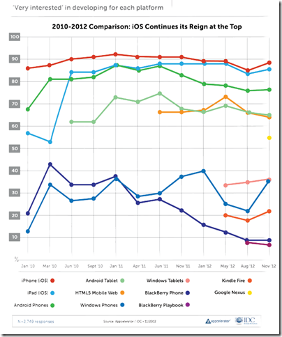
The report is still useful as a snapshot of how things look now, for cross-platform mobile developers. One question which is always asked, and therefore can be compared easily from one report to another, is the proportion of developers who are “very interested” in developing for each platform.

image

The top 5 contenders here are relatively stable, with Apple iOS top (iPhone and iPad), Android next (phone and tablet), and HTML5 Mobile Web also strong at about 65%.

The lower ranges are more interesting, as developers change their minds about prospects for the minority players. Windows Phone dived to around 22% in August 2012 but grew strongly to 36% in this report. Windows tablets, which we should probably take to mean the new Windows 8 app platform, is about the same. BlackBerry has declined from over 40% in March 2010 to 9% today, though I would suggest this will inevitably increase in the next report which will be after the launch of BlackBerry 10.

What else is interesting? One thing is Apple “fragmentation”. The problem here is that Apple iOS now has six screen sizes, once you add iPad mini and iPhone and iPad with or without high-res Retina displays. This gives me pause for thought. The challenge of mobile apps is now closer to that of desktop apps, where you do not know what display will be used or how users will choose to  size the application window. Intelligent layout and scaling is key.

Apple is also increasingly awkward to work with:

More generally, 90% of developers believe that Apple has become more difficult, or about the same, to deal with over the past three years when it comes to application
submission, fragmentation, and monetization.

Part of the report concerns Microsoft Surface. This focus is puzzling, in that it is the Windows 8 app platform which really matters, rather than Surface itself. Another oddity is the questions put, with no option to say “Surface is great”. The most positive option was:

It is a nice piece of hardware, but Windows 8 needs a lot more than that to be successful

A rather obvious statement which apparently won the agreement of 36% of developers.

The report gets even sillier when it comes to market disruption:

The top three companies that developers perceive to be ripe for disruption are a veritable who’s-who of the biggest tech darlings

say Appcelerator and IDC. It is true; but the figures are tiny:

Microsoft (8% of respondents), Google (7% of respondents), and Facebook (7% of respondents).

In other words, over 90% of developers believe these three companies are not likely to be disrupted soon; a figure that strikes me as conservative, especially for Microsoft.

More impressive is that over 60% of developers believe Facebook will lose out in future to a mobile-first social startup. This was also true last time round; 66% in Q3 2012 and 62% in Q4 2012.

The length of time it took Facebook to release just a single native iOS app, coupled with the fact that a corresponding native Android app is still MIA, has proven that the company does not yet have a viable cross-platform mobile strategy.

say Appcelerator and IDC. A fair point; but Facebook’s primary asset is its network of relationships rather than its software and it is not easy to disrupt. I would also guess that disruption is more likely to come from Google as it promotes Google+ and builds it more aggressively, perhaps, into Android, along with apps for iOS and other platforms as needed, than from a startup. But like the developers in this survey, I am guessing.

The Windows 8 app platform: how is it going? A few clues from developers

One way of looking at Microsoft’s Windows 8 strategy is as an attempt to establish a new tablet platform. By welding the tablet platform to the desktop platform, Microsoft ensured that every customer who wanted the latest Windows release would also get the tablet release, though some are stuck with keyboard and mouse to control it. The downside is that some users who would have upgraded to Windows 8 if it had been less radical will stick with Windows 7. Microsoft is betting that despite the controversy, the hybrid operating system is a better bet for the difficult task of creating a new ecosystem than building a completely new tablet operating system that few would have purchased.

So how is the new platform doing? I asked on Twitter for developers with apps on both Windows Phone 8 and Windows 8 to let me know how the rate of sales or downloads compare.

One was the maker of Cineworld, a cinema listing app for the UK and Ireland. He reported:

my cineworld app has about 1.8K downloads a month on WP.. on #win its a few hundred

The other was an app for fans of Manchester United football club called 1st4Fans:

Windows 8 is 70/day. Windows Phone is 130/day

Another was the maker of Barcode Generator:

Barcode Generator stats say 32K download since Aug and several hundreds dwn/day. Looks pretty good, isn’t it?

The author of TweeterLight says that he has “more downloads of W8 app in 1 month than WP7 app in 1 year”, showing that not everyone is finding the phone platform bigger than the tablet platform, though a key factor is that there is an official Twitter client for the phone but not for new-style Windows 8:

image

TweeterLight is also a paid-for app, which means fewer downloads and perhaps avoidance of the Twitter throttling that has afflicted the free clients.

Others are reporting a boom in Windows Phone downloads, like Lestyn Jones who says:

I’m finding that my #win8 app downloads are slowly growing where as my #wp8 have skyrocketed.

Put that together with the Cineworld stats – 1.8K per month for an app that is only relevant in the UK and Ireland. It does look as if Windows Phone has been considerably reinvigorated by the launch of Windows Phone 8.

Returning to Windows 8 though, my initial reaction was that these responses are not an impressive start for Microsoft’s new platform, considering the wide usage of Windows on the desktop.

My further reflection though is this. I find myself more willing to try out new-style apps on Windows 8 than desktop apps either on Windows 8 or previous versions, thanks to the ease of installation and removal, discovery through the store, and the additional security of the app sandbox. An interesting question to ask then: if Microsoft had not created this new app platform, how many of these niche apps would have been downloaded as desktop applications?

Despite its imperfections and mixed reception, at least Windows 8 now has an app platform.

This is a small sample and other reports would be welcome.

Review: Edifier MP250+ Sound to Go Plus

The problem: small mobile devices are great for portability but their built-in speakers (if they exist) are poor, thanks to their tiny size and sub-optimal enclosures. The latest tablets sound better than earlier models, but it still pays to plug in an external powered speaker.

Edifier’s Sound to Go Plus could be the answer. This wedge-shaped single-unit powered speaker system is 261mm long and 36mm high – in other works, a shade longer than a 10” iPad.

image

Several things are distinctive.

First, it feels robust and high quality, thanks to its brushed aluminium shell. Second, it is not just a powered speaker, but also a USB sound device that was recognised immediately by the Mac, Windows 8 and Windows RT devices I tried.

Third, it packs in four 1.25” drive units and a 30mm x 90mm passive bass radiator for a fuller sound that you might expect from such a compact speaker.

image 

The unit comes with audio cable, USB cable, and a simple black bag, though you will struggle to get the cables as well as the device into the bag.

Charging is via USB and no mains adapter is supplied. Many smartphone adapters will work, or you can charge from a PC or Mac.

Operation

image

The Sound to Go Plus has two modes of operation. The first is USB-based, and works by attaching the gadget to a PC or Mac and then selecting it as the default audio output device. The second is based on a standard 3.5mm jack socket. This is necessary, because most smartphones and tablets, including Apple’s iPad, do not recognise USB audio devices. Microsoft’s Surface RT is an exception, and worked fine with the Edifier and a USB cable.

image

The existence of two modes does add some complexity though. Edifier has designed it so that the analogue jack input takes priority. This means that if a jack cable is connected, the USB audio connection does not work. If both are connected to the same machine, neither works.

The advantage of the USB connection is first that it sounds better, and second that the device will charge while it plays.

Volume buttons are on each end of the device, down on the left, up on the right. Once connected, you turn the device on by depressing both simultaneously. This is smart, since it is unlikely to happen by accident in your bag.

Sound quality

Sound and mobile is all about compromise. I compared the Sound to Go Plus with several alternatives, from built-in speakers on an iPad or Surface RT, to various other portable systems.

The Sound to Go Plus was a big improvement on the built-in speakers. Sound is deeper, crisper, smoother and more detailed.

Compare to a grown-up pair of powered speakers like the superb Audyssey Lower East Side, admittedly more expensive and less portable, and the Sound to Go Plus is boxy, bass-shy and constricted.

That said, the Edifier sounds miles better than a old Creative Labs Travelsound unit I tried. The Travelsound is also a one-piece design, but with only a single drive unit per channel and no passive bass radiator. The Edifier won easily.

I was less sure about the comparison with the X-Mini Kai. The Kai is a mono unit but even with only one drive unit it lost only narrowly to the Edifier. The Kai’s brighter sound made the Edifier sound slightly muffled and the bass on the Kai is also decent, though in the end the Edifier’s smoother, weightier sound won my preference. The Edifier also feels stronger and more business-like than the quirky Kai with its concertina design.

Still, a unit like this is not about the ultimate in sound quality. It is about getting acceptable sound while on the go, and in this respect the Edifier impresses. It is not squawky or annoying, build quality is good, and watching a movie or playing background music with this is more fun than using what is built into a tablet.

Volume is just about good enough, though I would have liked a little more power.

Conclusion

The Edifier Sound to Go Plus is a great little device and worth considering if you are looking for better sound while travelling.


Review: Cooking the QOOQ way – do you want a tablet in your kitchen?

Throw out those cookery books. What you really want is a kitchen gadget that has thousands of recipes, searchable with a few quick taps, with video demonstrations for the tricky bits and extra features like auto-created shopping lists and the ability to play background music, right?

image

If that sounds good to you, you should take a look at the QOOQ, a 10” tablet designed for the kitchen. It is splash-proof and wipe-clean, with legs that sensibly lift it clear of the surface in case any pools of liquid should appear (not that they would).

Last week I visited Unowhy, the company behind QOOQ, at their Paris head office. I also got to try the QOOQ for a couple of days. It is a great little device, but there are some caveats, and note that you need an on-going subscription for full usage. Read on to see if QOOQ is for you.

The device

A QOOQ is a capacitive-touch tablet powered by a ARM Cortex A9 dual core chipset and running Linux. No, it is not Android; it reports itself as a QOOQ-specific Linux build, and the software is written in native code using the QT framework. It is also locked down so that you cannot get access to the operating system without a service password that is not supplied. This means you cannot install applications other than a few supplied utilities. This is an appliance, not a general-purpose tablet, though it does have a web browser, an email client, a photo viewer and a music player so it covers the basics.

The device feels sturdy and well made, though note that the protruding legs make it an awkward thing for most purposes other than sitting on a kitchen surface. There is a USB port and an SD card slot, so you can add music files or photos. An obvious secondary purpose is to add some family photos and have them display as a slideshow.

On the right-hand side of the unit are controls for on-off and volume.

image

On the left, the ports and headphone socket, behind a rubber cover that has an annoying tendency to come loose. You get card slot, USB 2.0 port, wired ethernet and audio. Nice to see the wired ethernet socket but I doubt this gets much use; how many households have wired ethernet in the kitchen?

image

I did not test battery life in detail but it worked fine for a few hours; however this is unimportant since it can be mains-powered during normal use.

Music sounds pretty good even through the built-in speakers. Of course you can get better sound using an external powered speaker.

Wi-Fi support covers B G and N standards and worked well for me.

Overall the hardware is excellent, well designed for its purpose. The main problem, aside from the loose cover mentioned above, is that if you operate the screen while cooking you will likely want to touch the screen sometimes with hands covered in food. QOOQ can easily be wiped clean, but a few dabs of flour or butter on the screen and it gets hard to read. A small hardware rocker for scrolling and clicking would help, so that you could avoid touching the screen itself.

The software

In the main, interacting with QOOQ feels like running a single application, though the web browser runs full screen and takes you out of it to some extent. The browser seems to be based on WebKit (like Apple Safari, Android and Google Chrome) and includes Flash player 10.1 though this is disabled by default; the system warns that it may run out of memory if Flash is enabled. Think of the browser as something basic for occasional use, though it does come into play for the QOOQ help system such as it is (more on that later). You could also look up recipes on the internet outside the QOOQ system (perish the thought) and take advantage of the device that way.

I could not figure out how to get screengrabs, so had to make do with the old point-the-camera-at-the-screen routine. Here is the home page.

image

You can see the idea. The main menu is on the left hand side, giving access to recipes, index of chefs, cooking guide, meal planner, shopping list, and the all-important search.

The home page includes  a spotlight recipe, online magazine, and on the right hand side, a customisable column of supplementary apps, including web browser, internet radio, weather app, video player, and access to local storage, though this last is limited to photos and music files.

Once into a recipe, QOOQ has a commendably clear layout. You get tabs for ingredients, utensils, and then the heart of it, preparation with step-by-step instructions. In the best case, there is a video available, to which the steps are hot-linked so that tapping a step shows how to do it in the video. Brilliant. If there is no video, then you get a colour picture of the finished dish as a minimum. There is also information on preparation time and cooking time.

image

Now the not-so-good. QOOQ is made in France and recently adapted for the English market. The biggest market is the USA, so all the weights and measures are in US-style cups, tablespoons, and imperial pounds and ounces. There was no way to change this in the review unit though Unowhy mentioned that metric measurements are on the way so there is hope.

There is also a problem with the videos. Most of the videos were recorded in French with chefs explaining their actions. In order to adapt them for English, Unowhy has overdubbed these with a rather wooden voiceover translation. You can still hear the French original faintly in the background. Not good.

Selecting Help is unrewarding for English users. You get a page not found message.

image

Along with the core recipe database, QOOQ has some other features. There is a meal planner, which works but sometimes caught us out. You cannot select Saturday and choose a meal; you have to select a recipe and add it to Saturday.

You can have QOOQ generate a shopping list and email it to you. This could be useful, though I was amused to see “13 3/8 tbs. Water” on my shopping list.

There is also a rather complex system of user profiles, tastes and techniques which frankly I never fully figured out (and help is no help as you can see above).

image

Users can build up profiles of which ingredients they like and which techniques they have mastered, which one assumes are taken into account if you use QOOQ’s meal suggestion feature, and possibly in other ways. I suspect many users will ignore this aspect of QOOQ.

Searching for a recipe

Cooking a meal is merely the last step in a process that begins with the harder task of deciding what to cook. QOOQ has a search feature that lets you search by recipe name, or by ingredient.

image

This is a little confusing. There are two search tabs. The first search tab is for “All QOOQ”.  You can search for recipes here, but only by name. If you select ingredients, you will be searching the food encyclopaedia, and end up with an entry all about onions, for example, rather than recipes containing onions. If you want to search by ingredient, you need the ingredient tab. Search shows the number of results as you type.

image

The results are shown in a scrolling list, in one of two views. The detail view is the best, and shows preparation time, difficulty, cost of ingredients, and cost to acquire the recipe if you do not have a full subscription (more on this later). You can filter the view in various ways, such as only recipes with videos. You can sort by various fields such as calories, or preparation time.

Despite the richness of the information, QOOQ’s search could do with some work. It is disappointing that you cannot filter by specialist requirements such as vegetarian or gluten-free meals. The search is also too complicated. QOOQ should learn from Google and have a single search page with intelligent results. Another limitation is that the recipe search does not account, we think, for synonyms, so you might have to experiment. Still, it is good enough and you will likely find what you want if QOOQ has it on offer.

Note that some of the recipes are on the internet and will be downloaded on the fly. This aspect works seamlessly, and any background downloads are invisible to the user.

The recipes

This is the heart of it. How are the recipes?

This is a collection for serious cooks. Note that Unowhy has focused on chefs, and persuading well-regarded chefs to share their techniques and recipes under the eye of a video camera. That is fantastique and beyond price for professionals or ardent throwers of dinner parties. I found QOOQ better than any cookery book I can think of for suggesting cooking ideas and enabling me to judge how feasible each recipe would be, bearing in mind available skills, ingredients, and batterie de cuisine.

That said, QOOQ leans strongly towards the high end of cooking. My search for a lowly Christmas Pudding came up blank; and the synonym Plum Pudding was no better.

image

I also looked in vain for general techniques like how to roast a duck (having enjoyed duck brûlée on a recent occasion); the duck recipes are all more advanced and interesting than that.

In other words, there are many wonderful recipes here that will inspire you, but I am not sure it is ideal as an everyday companion for the less expert, though this could easily be fixed by adding more content.

You are meant to be able to add your own recipes using software downloaded from the QOOQ site, but I could not find it; the French language site is more extensive so it is probably there somewhere.

The cost

Is QOOQ worth it? That is the question, and to answer this we need to look at the cost.

A QOOQ costs $399 which is about £260. For this you get the tablet and 1000 “recipes, videos and techniques”.

My loan QOOQ was able to search 3681 recipes. What about recipes beyond the supplied 1000?

Here you have two choices. You can purchase an all-you-can-eat (ho ho) subscription which is $99.00 (£65) per year or  $9.90 (£6.50) per month. Alternatively, you can buy individual recipes for credits. Recipes seem to cost between 2 and 8 credits, and a credit costs $4.90 for 20, so that means recipes cost from 50c to $2.00, or from about 30p to £1.30. Once purchased, a recipe is yours for ever.

Unless you are a professional, the individual recipes strike me as better value, especially as you can use them again and again.

Bear in mind though that there are countless free recipes on the internet, which you can even view on the QOOQ using the built-in browser. Certainly the QOOQ offers a premium experience and its recipes are exclusive. Having an expert chef explain a recipe to you in the comfort of your own kitchen is worth a lot. But this is not a mass market proposition.

A Google Nexus 7 or Nexus 10  device propped up against the toaster is not quite so good for cooking, but works in or out of the kitchen. A quick search for “splashproof iPad case” got me some results too.

Final thoughts

A QOOQ is a smart device with some fabulous content; yes it is the ideal gift for the cookery enthusiast who has everything. It is somewhat quirky and the transition from French to English is frustrating and incomplete in places.

Is it for the rest of us though? In its current form, probably not. That said, there is potentially a wide market for these recipes and videos, particularly if the company can build up a bigger collection of true English videos or improve the production of the French videos with English dubbing.

QOOQ would also benefit greatly from true social media integration. Currently you can rate your own recipes, but you cannot see other people’s ratings. I would like to see user ratings and discussions fully integrated, so you can learn what other people liked, what went wrong, discuss alternate ingredients and techniques and so on.

In the end it is all about the content, which is why the company would do well to promote its content more strongly apart from the device. We were told in Paris that users can subscribe to the web site and get recipes without having to buy a QOOQ, but I cannot see any way to do that currently (perhaps you can do this in French). This is needed, along with iPad and Android apps.

The QOOQ was born not out of a desire to make a kitchen tablet, but because the founders wanted a way of preserving recipes and skills. It was “how to immortalise recipes before you die”, as explained by company co-founder Guillaume Hepp.

The QOOQ should be a premium way to get the content, rather than the main delivery channel.

You can get your QOOQ here.

Xamarin brings C# to development of apps for the Mac App Store

Xamarin has released Xamarin Mac which adds Mac support to the existing iOS and Android compilers from the company:

  • MonoTouch: apps for iPhone and iPad using the MonoDevelop IDE on the Mac
  • Mono for Android: apps for Android using either Visual Studio or MonoDevelop
  • Xamarin.Mac: apps for Mac OS X using MonoDevelop on the Mac

The major platforms missing from the above are Windows and Linux (unless you count Android), even though Mono began as a Linux implementation of Microsoft’s .NET platform.

Xamarin says that a Windows version is not necessary since you can use Microsoft’s tools to code in C# for Windows desktop and Windows phone.

You can also get Mono for Windows, Mac and Linux from the old Mono project site.

Why would you bother with paid-for Xamarin.Mac when you can get Mono for Mac as a free download? There is even a Mac packager which lets you create a standalone package for your Mono app. A good question, but I guess the answer is the benefit of Xamarin-specific libraries and support from the company. Xamarin has also done the work to ensure that you can distribute your app via the Mac App Store.

Xamarin.Mac costs $399 for personal use, or $999 for an enterprise license which allows internal as well as app store distribution. A one year, one seat license with priority support costs $2,499.

Xamarin knows how to charge then, and in the end that may be a key reason why the project is working, whereas Mono struggled as an open source project that never had the resources it deserved.

The Mono Project site now says that it is “sponsored by Xamarin” so open source developers are getting some benefit from the commercial offshoot.

Xamarin is important for the C# language, since it represents a viable implementation which is independent of Microsoft.