Here’s the Apple OS X Dock (Leopard):

Here’s the Windows 7 taskbar (Beta 1):
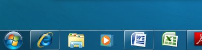
Note: the running apps in the Dock are indicated by the small white dot in the reflection. The running apps in the taskbar are indicated by the extra illumination in the top left corner of the icon (IE, Word and Adobe reader in the example).
Not only are they indicated by the extra illumination, they also get a button style border around them.
Man… I use a Mac and am not happy with the more subtle “white dot” that Apple implemented with the current version of Mac OS X (they used to use a small, black triangle placed below the running application and pointing up)… but Windows 7’s is too tooooooo subtle!
One thing I wish Apple would “borrow” from the taskbar is keeping a version of the icon available in the Dock so users could minimize from there. A small detail, but aren’t they all? All of the desktop metaphors are mixed nowadays so one more contradiction (is it an icon? is it an object?) won’t matter.
Well, typical of MS, is IE running or not. It’s got the border, but no extra illumination
“[…] is IE running or not. It’s got the border, but no extra illumination”
I guess it is too subtle because I see the illunination, so I assume it’s running.
Not surprisingly, the Mac’s superior display graphics allows for fancy translucency; MSFT’s bloated OS only manages simple effects.
Hmmm …. so Windows finally looks like NeXT OS with a whole lot of beatings from the ugly stick.
Not sure about bloated. I am running the Windows 7 beta in a VM on my iMac and it runs Firefox faster than the host… MS seems to be keeping it skinny so it becomes, amongst other things, the low cost Netbook OS of choice. Of course, that won’t bother Apple because Netbooks aren’t going to catch on, are they…
I don’t like that border (illumination) around running apps, that really looks bad designed. So I love the taskbar of Apple OS X – it’s well designed and has a nice illumination. Microsoft could learn from Apple I believe.
Pox on both their houses.
I want the NeXT dock back. Or at least the Tiger dock … at least get rid of the stupid reflective backdrop (no, replacing it with a solid background doesn’t cut it, I had set a completely clear dock on Tiger) and follow links in directory listings again.
At least I can change the hard-to-see glow to a nice easy-to-see triangle again.