Review: Here comes the Future by the Honeydrips

The Honeydrips is Mikael Carlsson, formerly in the Swedish band Dorotea. This is a beautiful album – the band’s sole release, as far as I know – combining Carlsson’s haunting, graceful vocals with electro-funk backing that echoes (more than echoes, in places) bands such as New Order and its predecessor Joy Division, though it is generally lighter in mood.

The album opens with some twanging guitar and the words “Last night I had the strangest dream”, setting a surreal atmosphere that persists throughout.

Favourite track: It was a sunny Summer day, a bland title disguising a cascade of melody, a touch of Carribean percussion, and bittersweet lyrics "it was a sunny summer day, when all my hope drifted away…"

"I know a place where you and I could go, if you’re up for trying something new" (from the second track) – give it a go. You don’t even need to buy it; try it on Spotify, which is where I discovered it, though I went on to buy the CD from the record label’s site:

http://www.sincerelyyours.se/boutique.php

proving that online music services really can result in a purchase.

Getting picky about the Windows 7 Taskbar – real-world flaws?

The new taskbar in Windows 7 is for launching applications as well as showing what is running; and one of the first things you do with a new installation is to pin your favourites there so they are easy to start.

Very soon, you’ll run out of space. This is a problem that will get worse, too, because app vendors will discover that the notification area is no longer effective for getting the user’s attention and background applications will use the taskbar instead.

Unfortunately a scrolling taskbar is not much fun to use. In fact, it’s a disaster. The taskbar divides itself into pages, and a fiddly scroller lets you flip from one page to the next.

Further, if you activate a running application which is on a different page, then its page comes into view, hiding the other icons.

Now let’s say you want to launch an application which is on a page that is no longer in view. Instead of clicking one large target (especially nice if you are using touch), you have one tiny target (especially horrible if you are using touch) – the up or down arrow on the scroller – followed by a second click on the app icon. Maybe there is a keyboard shortcut for scrolling the taskbar, but the only one I know is Win-T which cycles through all the icons – tedious.

At this point, you have two further options. You can increase the height of the taskbar. Right click – Properties – untick Lock the taskbar – then drag the top border up. Now you have more space for icons, but you have also lost valuable working space on the screen.

The second option is to use small icons, which is another option in properties. When you do this, you can fit in a few more icons, though not as many extra as you might expect. It is easy to see why this is so unsatisfactory. Here is the Word icon in normal size, followed by the small icon version:


Two observations. First, the “small” version is not that much narrower than the large one. Second, if you look at the size of the icon versus the amount of background, the small version is mostly wasted space. The actual image on the small icon is roughly 25% the size of the large. You get a poor yield in terms of extra icons, but a severe usability loss in that the small size is hard to see.

I don’t know if this problem can be improved by tweaking other Windows settings, but would be interested to discover.

It is also a shame that the taskbar cannot be extended across a second display, if you are running two or more screens.

The conclusion, in my case, is that neither the double-height nor the small icon view is really satisfactory, though double-height is less bad.

I like the new taskbar, but this is a real annoyance. Any tips I’ve missed?

Technorati Tags: ,,

Delphi developer virus exposes weakness in anti-virus defences

I found a real live instance of the Delphi-attacking virus W32/Induc-A yesterday. It was in the executable for FinalBurner Free from ProtectedSoft (ironic name in the circumstances), a decent freeware CD burning application. The file is burner.exe and I suspect the company has been shipping it for some time. I do not know if it affects the paid-for versions.

This malware was highlighted by Sophos though one thing Sophos does not make clear (as it is in the scaremongering business) is that the virus has only a mild affect. It only affects machines with ancient versions of Delphi installed – versions 5, 6 and 7 according to Marco Cantu – and its activity appears to be limited to replication. In other words, a successfully infected machine modifies Delphi’s runtime library so that it compiles infected executables, but does nothing else that I know of.

The implication is that the anti-virus companies, far from doing a great job at protecting us, have only just spotted a problem that has been around for months or possibly years. The burner.exe I found was dated 16 June 2009. If anyone has an older example, I would be interested to know; I’ve seen one report of an August 2008 infection.

Thus, when Delphi Product Manager Mike Rozlog comments to the Register’s report:

The best ways to combat these types of issues are to establish a deployment protocol that checks for viruses and trojans before shipping any applications

you have to ask: how? Clearly scanning with an anti-virus product would not have helped ProtectedSoft. Note that Sophos admits in its database that protection has been available only since 18 August 2009.

Despite the mild impact of W32/Induc-A (as far as we know so far) it is not something to take lightly. The attack looks like a proof-of-concept, to be followed by similar code with more serious impact, or possibly just an experiment that escaped into the wild. Maybe there are other more serious variants that the vigilant anti-virus folk will find in a month or two’s time.

How then can developers protect their machines? Another Reg reader says:

Instead, people should try to ensure the integrity of their development systems. Don’t connect them to the ‘net and don’t play games on them (duh!). Don’t have any foreign executables on them besides the OS and the compiler, transfer the sources there and compile them there. Run some kind of integrity checker to make sure that your compiler distribution hasn’t been tampered with. That sort of stuff.

Good advice, though not trivial to implement. A suggestion for Embarcardero: how about giving some thought to the problem and coming up with an easy means for developers to check the integrity of their runtime library files?

The disturbing aspect of this story is how malware can end up in shipping software from reputable companies; it could even be signed code. How long before something like this ends up in an executable shipped with an operating system itself, maybe with a timed payload so it lies dormant until well distributed?

BBC trying out HTML 5, video element

The BBC has an HTML 5 demonstration using the video element. The video itself is encoded in both Ogg and H.264. In the screenshot below I have just clicked on a navigation image to jump to a specific place in the video. The demonstration is meant to work in Firefox, Safari and Chrome, though for me it only ran in Firefox (3.5).

There is a detailed comment from the BBC’s Sam Dutton on why the proof of concept was put together here. There is an interesting remark on why the BBC is interested in this approach, which does not require a plugin like Adobe Flash or Microsoft Silverlight:

Flash and other Rich Internet Applications (RIAs) provide something like this already via timeline scripting, but RIAs are ‘black boxes’, using compilers and obfuscators to hide code and data: great if you want to protect intellectual property, whereas we needed to provide a mechanism whereby data and the code acting on it were open and accessible. HTML 5 and the jQuery JavaScript framework gave us the tools we needed without requiring extra plugins or proprietary software.

From a technical perspective, Dutton remarks that the HTML 5 solution is more efficient if you want to synchronize other elements with the playing video:

The HTML 5 audio and video elements remove the need for player plugins, work like any other HTML element in terms of styling and positioning, and standardise the programming interface for playback control. Less well known is that these elements emit a timeupdate event (at a frequency adjusted to fit available processing and memory) which removes the need to poll a player for the current time position. This makes media scripting far more efficient, since there is no need to run a loop or use setTimeout. In tests run on several machines we found that timeupdate events are emitted regularly and frequently (particularly in Firefox), whereas polling a media player for current video time is unreliable.

Dutton adds:

… it’s early days for us on this and there are a number of serious challenges before this becomes anything near mainstream – if ever.

The BBC is an influential site and its experiments will attract keen interest from those watching the evolution of web video.

Hands on Windows 7 multi-touch – will Apple get this right before Microsoft?

I’ve been trying a Dell Latitude XT2 with Windows 7 as a way of exploring multi-touch with Microsoft’s new operating system. I have a number of thoughts on the subject, which I will do my best to organize, but this is work in progress and I welcome your comments.

Multi-touch has received scant attention in all the Windows 7 coverage for one very good reason: few of us have the right hardware. Even a Tablet PC won’t do; you need one with that supports multi-touch which is one of a very few PCs on the market.

Touch is nevertheless a key issue, because it is the future of how we interact with our computers, particularly portable computers. 

Touch computers should have no keyboard or stylus

This one takes a bit of argument. I’ve used a Tablet PC for years, almost since their first release, and I like lots of things about them. However a lot of the time I use them in old-style keyboard mode. Why? Because the stylus is a nuisance and text input too fiddly. When Microsoft designed the Tablet PC, it should have made “doesn’t need a stylus” as the number one constraint, and “doesn’t need a keyboard” as another. It did not; and that is why Tablet PC has more-or-less failed.

There are several problems with the stylus concept. They are fiddly, expensive, and get lost easily. They make interacting with the device less natural. They introduce new problems while solving others.

As for the keyboard, it is a disaster. Once you concede the necessity of a keyboard, you end up with a clam-shell, twist-screen design that is complex, fragile and expensive. It is neither one thing nor another, and can never be mainstream.

The chunky finger problem

The stylus is a compromise that solves a particular problem: the finger is a chunky pointer. Typical menus and icons are designed with mouse-precision in mind, and stabbing them with a finger results in frustrating errors. Still, this problem bears a little analysis. Does a finger have less precision than a mouse pointer? Not really; human fingers are highly evolved and easily capable of the necessary precision. The Windows Touch Pointer (available in Vista as well as Windows 7) illustrates this. It is an on-screen mouse which represents a large target for the finger, but controls a pointer of high precision:

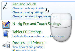
Using the touch pointer, the finger is just as precise as a real mouse, though it takes some mental adjustment, gets in the way, and is off by default in Windows 7.

The text input problem

The other advantage of the stylus is that it simulates a pen, making it easier to write or draw. This is actually an excellent reason to have a stylus as an option; but it should not be necessary for normal operations.

Text input without a keyboard is a partially unsolved problem, and the stylus is not a complete answer. Handwriting recognition is now pretty good on a Tablet; but I can still type faster than I write, and the pop-up input panel is an interference, especially when you only need to type a few letters. Apple’s iPhone (no stylus) has a good stab at making touch input work for text, and though I still don’t like it greatly, I think it is along the right lines.

Windows 7 and touch

What about Windows 7? Well, Microsoft has gone half-way towards making Windows touch-friendly. Multi-touch is a major advance, and gestures are a powerful concept enabling touch-driven applications that are much easier to use. A gesture interprets a pattern drawn on the screen as a single command; there is a list of Windows 7 gestures here, and developers can create their own.

Microsoft’s aim with Windows 7 was not to build a special touch interface, but to make the standard UI easy to control:

A touch shell for launching only touch-specific applications would not meet customers’ needs – there would be too much switching between “touch” mode and Windows applications. Instead, we focused our efforts on augmenting the overall experience so that Windows works great with touch.

This sounds good, but has Microsoft succeeded? My test was simple: start up in Tablet mode and see how easily I could work, without using the stylus.

I found using Windows 7 touch-only possible, but not always enjoyable. You can pump up the text size to make targets larger, but applications like Microsoft Office are still hard to use. The new taskbar is designed to be touch-friendly, and generally speaking it is, though not so much in the notification area. The Start menu is less good; and despite Microsoft’s concerns a touch-specific replacement may well be a good idea. Some applications, like Windows Media Player, seem fine with touch control; others, like Control Panel, awkward. Internet Explorer is relatively nice to use, and so is Apple’s Safari; I can well believe that it is designed with touch-control in mind.

One of the issues is that the on-screen keyboard does not always appear when you want it. It pops up automatically when you focus on standard text boxes; but for some reason it does not show up if I tap on a Sticky Note, for example; I have to drag it out manually.

The awkward truth: applications do need to be designed for touch in order to shine.

I do not know exactly what Microsoft and/or its OEM partners are planning for Windows 7 touch, but suspect we are going to see a few more high-priced niche items like the Dell Latitude XT2 – lovely hardware though it is – that essentially continue the Tablet PC theme and will not greatly impact the market.

The kind of device that might work, to my mind, would be:

1. Without keyboard or stylus

2. Priced keenly

3. Small – 12” screen at most

4. Bundled with excellent touch-friendly applications that are a pleasure to use – not just a collection of samples like the Windows 7 touch pack. Basic actions like web browsing, email, note-taking, and entertainment (games, media) should all be covered.

5. Preconfigured so that your first experience of Windows 7 multi-touch is not a frustrating one

Question: if that is right, is it likely that such machines will appear soon? Or is it more likely that Apple will deliver its rumoured tablet and severely impair Microsoft’s potential market?

Review: Quadrophenia on tour

Last night I saw the stage adaption of The Who’s Quadrophenia by Jeff Young, John O’Hara and Tom Critchley, at  the Royal Concert Hall in Nottingham. The venue was well filled though not quite sold out, a good effort considering that it is on for several days.

Quadrophenia is one of my favourite albums, though I don’t know how much this is because of inherent artistic quality, and how much because it resonated with me when it first appeared 36 years ago. It is not really about multiple personalities, more about the multiple roles that all of us play, such as child, worker, lover, rebel, and the conflicting feelings that can engender. It is about dysfunctional families, drugs, sex, gangs, and the stress of trying to conform to conflicting norms, such as dutiful worker vs rebellious youth culture. It is quasi-religious, with the rain and the sea representing some higher power.

The show was disappointing. Why? Well, the first problem is the stage layout. The musicians are at the back of the stage, on an extraordinary two-storey platform, and it’s pretty hard to see what they are doing since during most of the show the lights are elsewhere. During the second half of the performance, it is even harder to see the band because of a big circle thing that appears in front. I suppose this was somewhat like having the orchestra in a pit at a classical opera; but I didn’t like it. A rock concert is about the dynamics between the band and the audience, and if you put all these barriers in the way, it makes it hard for the music to live.

The main part of the stage was where the action took place. Jimmy, the lead character in Quadrophenia, is played by four actors, the idea being that each one represents a different face of his internal personas. In an early scene we see Jimmy seated on a sofa between his parents; just as he gets comfortable, an alter ego Jimmy comes and turfs him out of his place, only to be displace in turn shortly after. I thought that was effective; but in general having four actors did not work well. The first problem was that they were not sufficiently distinct; frankly, I couldn’t tell you what kinds of characteristics each of the four was meant to represent. Second, the artifice of having four Jimmys on stage together when in a sense there was only one of them was largely unsuccessful. I would rather have had them mostly on stage one at a time.

There was no speech, just the music and singing Who songs. Not all the songs were from Quadrophenia – we also got some other early Who numbers like My Generation. However, the singers also did a poor job of engaging with the audience – in fact, at some points I wasn’t sure if they were singing or miming to a recording. There was a lot of jumping around and climbing up the big circular thing, which rotated.

The show is lacking in contrasts. Quadrophenia is a album of transitions: the claustrophobia of a small terraced house where Jimmy lives with his mum and dad; the scooter as the vehicle to the freedom of the open road; the “5.15” train which takes Jimmy to Brighton, place of conflict and redemption, and to the sea. The show does a poor job of representing these contrasting places and colours; each scene feels the same as the one before it.

The singers were competent but not strong enough for what they took on. Roger Daltrey is a hard act to follow, for sure. At times during choral sections Quadrophenia reminded me of Joseph and his Technicolour Dreamcoat, a jolly musical originally intended for schools; I do not think Quadrophenia should ever sound like that.

My advice for the next tour: bring the band into view; lose half the actors; have one Jimmy at a time; sing at the audience not at one another, and sing your heart out. Quadrophenia deserves it.

PS for some alternate views see the official forum; lots of praise on there. At Nottingham the audience reaction was mixed; strong applause at the end, yet the seats in front of us were filled for the first half and empty for the second.

Fixing a Windows PC with Knoppix

Last night I took a look at a poorly Windows XP box. It would not boot; error was:

C:\Windows\System32\Hal.dll missing or corrupt:
Please re-install a copy of the above file.

The one thing you can be confident about is that doing what the error message says will not fix the problem. I suspected an issue either with a failing hard drive, or with boot.ini. It was not boot.ini, and to my surprise the drive checked out OK using the long (most thorough) test in the manufacturer’s utility. There were files missing though, so I ran chkdsk /r and then tried a repair install. To do this, you boot from the setup CD, choose to install Windows, and then choose the option to repair an existing installation; it usually does a good job of preserving documents, applications and settings.

Everything was going fine until well into the repair. Setup came up with a message I had not seen before:

The file ‘Asms’ on Windows XP Home CD-ROM is needed. Type the path where the file is located, and then click OK.

It turns out that this means setup cannot communicate with the setup CD.  Microsoft has a fix which did not work for me; the UPPERFILTERS and LOWERFILTERS registry keys mentioned there did not exist, though it was interesting to discover that you can press Shift+F10 during setup and get a command prompt. However, the command prompt could not see the CD either.

Even if you cancel the setup, it automatically resumes on reboot. All I needed to do was to copy the setup files (contents of the i386 folder) from the CD to the hard drive. However, the bafflingly crippled XP recovery console does not support either xcopy, or wild card copy, or copying directories.

I found an easy solution for this in Knoppix, a version of Linux designed to run from CD.I downloaded the latest version 6.0.1 which has read-write access to NTFS drives by default, booted Knoppix, copied the WIndows XP setup CD to a folder on the hard drive, and re-booted Windows. Setup resumed, and when I got the Asms error I pointed setup to the new folder. I had to do this multiple times (fortunately Ctrl-C and Ctrl-V works) but it was not difficult and the repair completed successfully.

Technorati Tags: ,

Where next for Adobe ActionScript?

The Flash community is disturbing the quiet of August by beating up ActionScript, the language of Flash, Flex and AIR. ActionScript is based on JavaScript, and took huge strides in version 3.0, introduced with Flash Player 9. Just-in-time compilation greatly improved performance, while the core language got optional strong typing, namespaces, sealed classes, and other features that brought the language closer to Java or C#. Adobe was endeavouring to implement ECMAScript 4.0, which at the time was also meant to be the future standard for JavaScript in the browser, though ECMAScript has since gone in a different direction.

Nevertheless, a number of influential Flash developers are saying “not good enough”. Sascha Balkau has a good summary and lists some of the requested features, including method overloading, generics, threading, abstract classes, and enums. Nicolas Cannasse talks about the failure of ActionScript 3. Joa Ebert is unhappy with the community process and observes that Google’s V8 is faster than ActionScript which in his view is ridiculous. Jesse Warden also complains about performance and asks for the performance gains from the amazing Alchemy (which compiles C/C++ to ActionScript) to be available to all ActionScript code. Peter Elst asks for ActionScript to be decoupled from the player and replaced with a dynamic language runtime.

Why all the fuss? This is the pace of development in the industry putting pressure on Adobe. There are undoubtedly Flash developers casting envious glances at Silverlight’s .NET Framework, which meets many of the above requests – though let’s not forget the Silverlight developers casting envious glances at Flash in areas like text handling or simply its wider adoption – and the Google factor is also an interesting one.

Miguel de Icaza tweets mischievously about how Adobe should adopt Mono and get C#; and in many ways he’s right. Not that Adobe should necessarily adopt Mono; but that it should be using a language and virtual machine that is shared with a wider community – which I guess is what was intended for Tamarin, though that has not worked out well so far.

In the meantime, I’m guessing that Adobe will be coming up with improvements to meet at least some of these requests – multi-threading, surely, and the next stage in Alchemy. MAX 2009 in October?

UI design patterns for Rich Internet Applications

We are used to the idea of design patterns for software construction, following the great work of the gang of four – Design Patterns: Elements of Reusable object-oriented software by Erich Gamma, Richard Helm, Ralph Johnson and John M Vlissides. But what about patterns for user interface design? What about learning standard UI patterns and how to apply them well, so that you have an immediate head start when sitting down to create a compelling and usable application?

Ryan Stewart’s blog post on up-leveling the Flex User Interface Discussion links to the work of Theresa Neil, who spoke on Designing Rich Application at the DelveUI conference last week. She’s posted her slide show, which I’ve also embedded below:

I found it fascinating, and while I will never be a designer, this kind of methodical, structured approach to building a UI is one that developers can also appreciate.

She also has a matrix of essential controls showing which UI frameworks support them – page 21 above – though the slide only shows controls from A to D; the full set is described here.

While I’m on the subject, there’s also a thought-provoking post from Brandon Walkin on managing UI complexity. It seems Microsoft can still provide plenty of “how not to do it” examples.

Windows 7 tip: use Group by to merge and manage library views

I’ve been looking forward to the libraries feature in Windows 7. For example, on my desktop PC I keep some downloads in my personal download folder – under c:\users\[username]\Documents\Downloads – while others are in a download folder on drive E. It makes sense to treat this as one location, rather than two. Libraries let you view these two folders together, without physically merging them.

That said, Windows 7 tripped me up. I created a new library, called Downloads. I added the two folders. I was annoyed though to see that I had two separate lists of folders in the new library, not one. I wanted a single, merged list.

I clicked around to see if there was a way of merging the lists. I tried the Arrange by menu. If you arrange by Name, you get a single merged list but without folders at all – in my case, thousands of files. Arranging by folder got me back to the separate listings. I tried the Organize menu, but that didn’t help. I tried right-clicking, with promising options like Expand group and Expand all groups, but these were simply different ways of viewing the location groups.

Then I noticed that the default Documents library had exactly the view I wanted, merging the personal and public Documents folders. Had Microsoft included some magic for the built-in libraries, or was I missing something?

I was missing something. I found out what when I clicked Organize – Layout – Menu bar. Of course this is off by default, because someone at Microsoft has a religious aversion to menus; they have been removed entirely from most of Office. But once I had the menu bar, I found the View – Group by option. If I select View – Group by – None, then I get the merged folder list that I want.

In fact, all the Group by options seem to work on a merged list, which leads to strange fact number two: once I had the merged list, it was not obvious how to get back to the non-merged list. It is as if there is a Group by Location which is not on the menu. I did eventually work it out. To get back to the non-merged list, choose View – Arrange by – Clear changes. Obvious, eh?

Incidentally, there is a way of using Group by without displaying the menu bar. You have to right-click in the left margin of the right-hand pane of the library listing. Easy when you know how.

Technorati Tags: ,