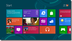
I wrote a first look for Windows 8 Release Preview for The Register which prompted, as you would expect, a barrage of comments from Reg users, most expressing distaste for Redmond’s latest. Buried on page three of the comments though is this one which is worth calling out, since it explains some of the thinking behind Aero Glass in Windows Vista and how that same thinking is expressed in the Metro design – though note that the user mdc (who is that?) says in a later comment that he has “moved into a different field entirely (photography)” so is not responsible for Metro or Windows 8.
Anyway, mdc observes that Microsoft has been working for years on the idea of a “content-centric” user interface, one where the surrounding chrome disappears so that content is king. In this respect, Glass can be seen as a move towards the Metro immersive UI:
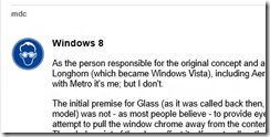
The initial premise for Glass (as it was called back then, the Aero UX sprung up around the Glass model) was not – as most people believe – to provide eye candy for the end user. Instead, it was an attempt to pull the window chrome away from the content and make it as unobtrusive as possible. The whole point of the glass effect itself was to allow the end user to make better use of their screen real-estate by allowing them to see content beneath the active window.
Glass was not radical though, and did not change the model of multiple overlapping windows. According to mdc though, something more revolutionary was considered for Vista:
Some of my other concepts promoted a VERY different approach to the user experience, much more in line with what is seen today in Windows 8. In fact, the premise for the shift in the desktop paradigm goes back as far as the early Blackcomb concepts first demoed by the MSN services division in 1999; it has ALWAYS been felt that the desktop itself is a rather clunky way of providing content to the end user, which is – after all – the purpose of computing devices, be they traditional desktops, laptops, phones, or even set-top boxes. Windowing systems were designed to allow users to work on multiple pieces of data in quick succession, and yet over the years usability studies have found that users rarely manipulate more than 2 documents simultaneously.
In the end the idea was rejected, partly because of the work involved, and partly because Microsoft’s Jim Allchin, among others, felt that the familiarity of the Windows user interface was an important selling point versus the competition.
Apparently we are wrong to imagine that Windows 8 is based on the Windows Phone design:
While some have suggested that Windows 8’s interface is "touch-only" or "based on Windows Phone 7", that couldn’t be further from the truth. Windows Phone 7 was instead a pilot program – in a relatively low risk sector – for the designs originally suggested for Blackcomb, which have now found their way into Windows 8. At the time, touch interfaces hadn’t even been conceived of – remember, back then touch sensitive screens were Resistive nasties that required at best a stylus, or at worst jabbing at them hard with a finger or pen.
The fact is that Metro just happened to be easily accessible for touch devices, and that has been touted as one of its benefits; it is NOT, and never has been, the original aim of the design. The aim of the design is exactly the same as Aero was – to take the chrome away from the content, and allow the user to focus on what they’re doing rather than unnecessary clutter. A perfect example of this is internet Explorer on Metro; in its default state, all you see is a webpage; chrome CAN be pulled up if the user requires, but is otherwise absent. The majority of Metro applications are like this – in fact it’s part of the Metro UX specifications.
and he adds:
Personally, I see Metro as a good thing; it allows me to do my work without distraction, and I’m just disappointed that I wasn’t the one who did the design work for it this time around.
Windows 8 Metro is not just about touch then: it is a reshaping of the user interface to put content first.
