I’m in one of those long calls to support where you wait for ages before a human answers, which is my excuse for slipping up. I’ve had the iPhone keypad open to navigate menus but now I want to hide the keypad.
There is a button for this:

Unfortunately the text that looks like a caption is a button, and the button that looks like it is captioned is the button for hanging up. And I have to call back and wait again.
Yes I should know better but I do not think this is good design. The “button” for Hide Keypad is not even underlined or highlighted to show that it might do something when tapped.
Here is another one, from Apple Music. I am on the home page and want to search for some music. There is a Search button or perhaps tab indicator top left:
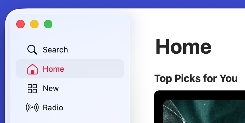
Tap Search though, and there is nowhere to type. Wait a moment, yes there is. It is up at the top and there is not even a flashing cursor to show that I can type there. I have to click again to do that, not where it says Search, but where it says Apple Music:
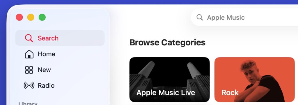
This is on the Mac desktop app; the mobile one is a little better but not great.
I am guilty of clicking Search multiple times before realising that I have to click where it says Apple Music.
I think I get the intent here; the UI is steering you towards clicking/tapping on categories rather than typing a search. To me though, that is browse rather than search.