Microsoft, Windows 8, and the Innovator’s Dilemma (or, why you hate Windows 8)

One thing is obvious from the immediate reaction to Windows 8 Release Preview. Most of those who try it do not like it. It is a contrast to the pre-release days of Windows 7, when there was near-consensus that, whatever you think of Windows overall, the new edition was better than its predecessors.

Why would a company with huge resources and the world’s most popular desktop operating system – 600 million Windows 7 licenses so far, according to OEM VP Steven Guggenheimer – create a new edition which its customers do not want?

Microsoft under Steve Ballmer is a somewhat dysfunctional company – too many meetings, says ex-softie Brandon Watson – but there is still a wealth of talent there. Specifically, Windows President Steven Sinofsky has proven his ability, first with Microsoft Office 2007 which beat off the challenge from OpenOffice.org, and next with Windows 7, which if it repeated the disappointment of Windows Vista would have damaged the company severely.

If it is not incompetence, then, what is it?

In this context, Clayton M. Christensen’s 1997 classic The Innovator’s Dilemma – When new technologies cause great firms to fail is a good read. Chapter one is here. Christensen studied the hard drive market, asking why sixteen of the seventeen companies which dominated the industry in 1976 had failed or been acquired by 1995, replaced by new entrants to the market. Christensen argues that these firms failed because they listened too much to their customers. He says that delivering what your customers want is mostly a good idea, but occasionally fatal:

This is one of the innovator’s dilemmas: Blindly following the maxim that good managers should keep close to their customers can sometimes be a fatal mistake.

Specifically, hard drive companies failed because new entrants had physically smaller hard drives that were more popular. The reason the established companies failed was because their customers had told them that physically smaller drives was not what they wanted:

Why were the leading drive makers unable to launch 8-inch drives until it was too late? Clearly, they were technologically capable of producing these drives. Their failure resulted from delay in making the strategic commitment to enter the emerging market in which the 8-inch drives initially could be sold. Interviews with marketing and engineering executives close to these companies suggest that the established 14-inch drive manufacturers were held captive by customers. Mainframe computer manufacturers did not need an 8-inch drive. In fact, they explicitly did not want it: they wanted drives with increased capacity at a lower cost per megabyte. The 14-inch drive manufacturers were listening and responding to their established customers. And their customers–in a way that was not apparent to either the disk drive manufacturers or their computer-making customers–were pulling them along a trajectory of 22 percent capacity growth in a 14-inch platform that would ultimately prove fatal.

Are there any parallels with what is happening in computer operating systems today? I think there are. It is not exact, given that tablet pioneer Apple cannot be described as a new entrant, though Google with Android is a closer match. Nevertheless, there is a new kind of operating system based on mobility, touch control, long battery life, secure store-delivered apps, and cloud connectivity, which is eating into the market share for Windows. Further, it seems to me that for Microsoft to do the kind of new Windows that its customers are asking for, which Christensen calls a “sustaining innovation”, like Windows 7 but faster, more reliable, more secure, and with new features that make it easier to use and more capable, would be a trajectory of death. Existing customers would praise it and be more likely to upgrade, but it would do nothing to stem the market share bleed to Apple iPad and the like. Nor would it advance Microsoft’s position in smartphones.

Should Microsoft have adapted its Windows Phone OS for tablets two years ago, or created Metro-style Windows as an independent OS while maintaining Windows desktop separately? YES say customers infuriated by the full-screen Start menu. Yet, the dismal sales for Windows Phone show how difficult it is to enter a market where competitors are firmly entrenched. Would not the same apply to Windows Metro? Reviewers might like it, developers might like it, but in the shops customers would still prefer the safety of iPad and Android and their vast range of available apps.

You begin to see the remorseless logic behind Windows 8, which binds new and old so tightly that you cannot escape either. Don’t like it? Stick with Windows 7.

Microsoft will not say this, but my guess is that customer dissatisfaction with Windows 8 is expected. It is the cost, a heavy cost, of the fight to be a part of the next generation of client computers. It is noticeable though that while the feedback from users is mostly hostile, Microsoft’s OEM partners are right behind it. They do not like seeing their business munched by Apple.

The above does not prove that Microsoft is doing the right thing. Displeasing your customers, remember, is mostly the wrong thing to do. Windows 8 may fail, and Microsoft, already a company with shrinking influence, may go into an unstoppable decline. Bill Gates was right about the tablet taking over from the laptop, history may say, but Microsoft was incapable of making the radical changes to Windows that would make it work until it was too late.

Give credit for this though: Windows 8 is a bold move, and unlike the Tablet PCs that Gates waved around ten years ago, it is an OS that is fit for purpose. Sinofsky’s goal is to unify the smartphone and the tablet, making a new mobile OS that users will enjoy while also maintaining the legacy desktop and slotting in to enterprise management infrastructure. I admire his tenacity in the face of intense protest, and I am beginning to understand that foresight rather than stupidity underlies his efforts.

Windows Azure get new hybrid cloud, infrastructure as a service features

Microsoft has announced new preview features in Windows Azure, its cloud computing platform, which introduce infrastructure as a service features as well as improving its support for hybrid public/private clouds.

The best summary is in the downloadable Fact Sheet (Word document). One key piece is that virtual machines (VMs) can now be persistent. Previously Azure VMs were all conceptually stateless. You could save data within them, but it could be wiped at any time since Azure may replace it with the original you created when it was first deployed.

Supported operating systems are Windows Server 2008 R2, Windows Server 2012 RC, and four flavours of Linux.

One of the features mentioned by VP Bill Laing is the ability to migrate VHDs, the virtual hard drives used by Hyper-V and Azure, between on-premise and Azure:

Virtual Machines give you application mobility, allowing you to move your virtual hard disks (VHDs) back and forth between on-premises and the cloud. Migrate existing workloads such as Microsoft SQL Server or Microsoft SharePoint to the cloud, bring your own customized Windows Server or Linux images, or select from a gallery.

Windows Azure Virtual Network lets you extend your on-premise network to Azure over a VPN. This sounds like the existing feature called Windows Azure Connect first announced at the end of 2010, though since Azure Virtual Network is also a preview this seems to be talking a long time to come to full release.

Windows Azure Web Sites is a new web hosting offering. Previously, Azure was focused on web applications rather than generic web sites. This new offering is aimed at any website, running on Internet Information Server 7 with supported frameworks including ASP.NET, PHP and Node.js. MySQL is supported as well as Microsoft’s own Azure SQL Database based on SQL Server.

There is also a new management portal in preview. Azure SQL Reporting is out of preview, and there are also new services for media, caching, and geo-redundant storage.

My guess is that Microsoft-platform customers will welcome these changes, which make Azure a more familiar platform and one that will integrate more seamlessly with existing on-premise deployments. No doubt Microsoft also hopes to compete more effectively with Amazon’s EC2 (Elastic Compute Cloud).

One thing which I will would like to know more about is Azure’s elasticity, the ability to scale on demand. Laing describes Azure Web Sites as a “highly elastic solution,” and the Fact Sheet mentions:

the ability to scale up as needed with reserved instances.

It is not clear though whether Microsoft is offering built-in load balancing and scaling on demand, an area where both Azure and System Center 2012 (Microsoft’s private cloud management suite) are relatively weak. That is, scaling is possible but complex to automate.

In Windows 8: the perfect Metro news app for obsessives

I have been playing with the Metro apps in Windows 8 Release Preview. It is only a small thing, but I am impressed with the ease with which you can customise the Bing News app to add your own special interests. See the video below for a quick demonstration.

You will also see that I struggled to find out how to remove a custom section. This seems to be the way with Windows 8 in Metro: easy when you know how, but you have to figure it out.

Ninja Gaiden 3 comes to Nintendo Wii U

I had enormous fun with Ninja Gaiden on Xbox, especially the first version which was repeatedly refined until, as Ninja Gaiden Black, it came near to gaming perfection. Never mind the plot: the action was intense, challenging and deep.

Ninja Gaiden 2 was more gory but less satisfying, though it was another big game with gorgeous environments – I particularly liked the watery city which was reminiscent of Venice – and more important, tough fighting that rewarded skill rather than button-bashing.

Ninja Gaiden 3 on the other hand was a disappointment, removing most of what was enjoyable about the game. The combat system was simplified and it became just another button bash.

Now the game is among those promised for the Nintendo Wii U. Is it possible that the new version, called Razor’s Edge, fixes the problems?

image

The description does seem to recognise what went wrong:

NINJA GAIDEN 3 has been reworked to bring to Wii U the truly intense, high-speed challenge and action NINJA GAIDEN fans demand. With more weapon and Ninpo types, a new character progression system, a redesigned battle system and the return of dismemberment, NINJA GAIDEN 3: Razor’s Edge improves upon the original NINJA GAIDEN 3 in every way and offers Wii U exclusive features and functionalities.

Improving on the original Ninja Gaiden 3, you might remark, will not be difficult. Even so, fans now have some reason to hope for another decent edition of Ninja Gaiden.

Microsoft announces Internet Explorer for Xbox 360, makes bid for living room

At the E3 conference in Las Vegas Microsoft has made a series of announcements focused on its Xbox 360 games console, but also relating to Windows Phone, Windows 8, and even Apple iOS and Google Android.

image

Xbox SmartGlass is a free app for Windows Phone, Windows 8, iOS and Android which links communicates with the Xbox. Examples include:

  • Watching a movie on a tablet while travelling, getting half way through, and automatically resuming on the Xbox at home.
  • Seeing related content on your tablet such as team members, maps, game inventory, and so on, while the TV or game action takes place on the main Xbox screen.
  • Using the tablet to navigate web pages that are also displayed in Internet Explorer on the Xbox, tapping links and using pinch and zoom.

image

Yes, IE is now promised for the Xbox “this fall”, and there will be a new web hub. No word yet about Adobe Flash, but with a strong focus on multimedia in this context, it would certainly make sense to include it, as Microsoft has done for Metro-style IE in Windows 8. In fact, the browser shown at E3 on Xbox looked reminiscent of the Windows 8 Metro version.

Other major consoles also have web browsers, so what is special about Microsoft’s late inclusion of the same feature? The company says that web browsers on other consoles are little used because they are hard to navigate, and is counting on a combination of Kinect voice control and SmartGlass to make it work better on Xbox.

Another problem though is that most web sites are simply not designed for viewing from twelve feet back. A second awkward question: if you have your tablet out, why not just use the tablet’s own web browser?

It makes little sense for general web browsing, but can work for playing videos or viewing images, which I guess is the main idea here.

Microsoft has also announced Xbox Music, which sounds like a replacement for Zune and its subscriptions. You will be able to download and/or subscribe to 30 million tracks, and the service will work seamlessly, according to Microsoft, on Windows Phone, Xbox and Windows 8.

Watching the E3 press event was an odd experience. Xbox games are still dominated by macho fighting titles like Halo, Splinter Cell, and Black Ops, all of which were demonstrated complete with bone-crunching violence, death and mayhem. At the same time, Microsoft is trying to make the console the entertainment hub for the whole family, and for movies and sport as much as for games, so we also got Dance Central 3, and exercising with Nike plus Kinect.

One thing not mentioned was Xbox vNext. The 360 was released in November 2005, an eternity ago in technology terms. The hardware has held up well, but even so, if Apple pulls out something TV-related soon (perhaps even at its WWDC event next week) then it will have the advantage of being able to release something based on up to date hardware.

Windows Vista designer pops up to explain and defend Windows 8

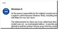
I wrote a first look for Windows 8 Release Preview for The Register which prompted, as you would expect, a barrage of comments from Reg users, most expressing distaste for Redmond’s latest. Buried on page three of the comments though is this one which is worth calling out, since it explains some of the thinking behind Aero Glass in Windows Vista and how that same thinking is expressed in the Metro design – though note that the user mdc (who is that?) says in a later comment that he has “moved into a different field entirely (photography)” so is not responsible for Metro or Windows 8.

image 

Anyway, mdc observes that Microsoft has been working for years on the idea of a “content-centric” user interface, one where the surrounding chrome disappears so that content is king. In this respect, Glass can be seen as a move towards the Metro immersive UI:

The initial premise for Glass (as it was called back then, the Aero UX sprung up around the Glass model) was not – as most people believe – to provide eye candy for the end user. Instead, it was an attempt to pull the window chrome away from the content and make it as unobtrusive as possible. The whole point of the glass effect itself was to allow the end user to make better use of their screen real-estate by allowing them to see content beneath the active window.

Glass was not radical though, and did not change the model of multiple overlapping windows. According to mdc though, something more revolutionary was considered for Vista:

Some of my other concepts promoted a VERY different approach to the user experience, much more in line with what is seen today in Windows 8. In fact, the premise for the shift in the desktop paradigm goes back as far as the early Blackcomb concepts first demoed by the MSN services division in 1999; it has ALWAYS been felt that the desktop itself is a rather clunky way of providing content to the end user, which is – after all – the purpose of computing devices, be they traditional desktops, laptops, phones, or even set-top boxes. Windowing systems were designed to allow users to work on multiple pieces of data in quick succession, and yet over the years usability studies have found that users rarely manipulate more than 2 documents simultaneously.

In the end the idea was rejected, partly because of the work involved, and partly because Microsoft’s Jim Allchin, among others, felt that the familiarity of the Windows user interface was an important selling point versus the competition.

Apparently we  are wrong to imagine that Windows 8 is based on the Windows Phone design:

While some have suggested that Windows 8’s interface is "touch-only" or "based on Windows Phone 7", that couldn’t be further from the truth. Windows Phone 7 was instead a pilot program – in a relatively low risk sector – for the designs originally suggested for Blackcomb, which have now found their way into Windows 8. At the time, touch interfaces hadn’t even been conceived of – remember, back then touch sensitive screens were Resistive nasties that required at best a stylus, or at worst jabbing at them hard with a finger or pen.

The fact is that Metro just happened to be easily accessible for touch devices, and that has been touted as one of its benefits; it is NOT, and never has been, the original aim of the design. The aim of the design is exactly the same as Aero was – to take the chrome away from the content, and allow the user to focus on what they’re doing rather than unnecessary clutter. A perfect example of this is internet Explorer on Metro; in its default state, all you see is a webpage; chrome CAN be pulled up if the user requires, but is otherwise absent. The majority of Metro applications are like this – in fact it’s part of the Metro UX specifications.

and he adds:

Personally, I see Metro as a good thing; it allows me to do my work without distraction, and I’m just disappointed that I wasn’t the one who did the design work for it this time around.

Windows 8 Metro is not just about touch then: it is a reshaping of the user interface to put content first.

Getting started with Windows 8: Four things new users need to know

Today I upgraded a laptop from Windows 7 to Windows 8 Release Preview and watched the owner’s first steps with the new operating system – a bit like the Chris (or Joe) Pirillo experiment, except this was an in-place upgrade so a somewhat familiar environment.

Nevertheless, the user struggled to get going. Microsoft could (and I hope will) make this easier by spelling out the use of four simple features which are needed in order to navigate and control Windows 8 successfully.

Note: this is for users with keyboard and mouse. If you have a touch screen or even a new laptop with a trackpad designed for Windows 8, it is easier.

1. How to open the Start menu. There are several ways:

a) Move the mouse down to the bottom left corner or just beyond. A Start button appears.

image

b) Move the mouse down to the bottom right corner or just beyond (tablet users swipe from the right edge). The Charms bar appears and you can click Start.

image

c) Press the Windows key, or Ctrl-Esc if you do not have one. Seems obvious; but my victim did not think to do so. It appears that the Windows key is not that popular with users.

2. How do you close or exit a Metro-style app? Easy – see above – bring up the Start menu. This is not obvious though. My user instinctively pressed Esc, which did not work.

3. How do you control a Metro-style app? There are two key things to learn:

a) Right-click the mouse (swipe up on a tablet) to summon app menus and controls. For example, in the Music app this gets you play controls.

image

b) Mouse to bottom right corner or just beyond and click Settings. In Windows 8 the Settings on the Charms bar are dynamic. App settings appear here. For example, in the Music app you can get at your account settings and other preferences, or even change the volume.

image

4) How do you switch between apps? Answer: Alt-tab is your friend. This is the most reliable way to see all running desktop and Metro-style apps and switch between them.

Another thing to try is to move the mouse to the top left corner or just beyond until a thumbnail appears, then drag down. Touch users swipe from the left and immediately back out. This shows thumbnails of running Metro-style apps, plus one for the desktop. Right-click a thumbnail for options including Close.

image

There are a couple of problems with this feature. First, the gesture or mouse movement is not obvious. Second, it does not show all running apps, since the desktop shows as a single thumbnail.

The big question: how will Microsoft get users past the initial hump of not finding the Start menu or other essentials? I have seen even highly technical users slip up. for example someone who thought Metro-style Mail was broken because it opened as a mainly blank screen with the word Mail and no obvious way to get it working. The solution is Charms and then Settings, but this kind of problem is frustrating.

A human guide is ideal, but failing that what can Microsoft do? Users often ignore introductory tutorials, so I would suggest on-screen help like pointing arrows for those critical first minutes.

The deeper question: are these problems a sign of something wrong in the Windows 8 design, or is it to be expected when radical changes are made to a familiar system? My instinct is that Microsoft could have done more to make it discoverable, but I do not see it as a showstopper. Users will learn.

Huge icons in Windows 8 Metro

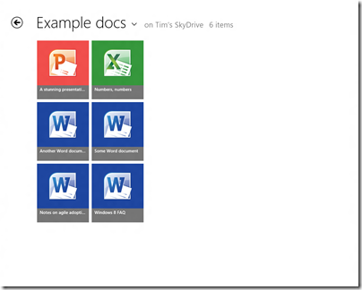
This is the SkyDrive Metro-style app running on my 1280 x 1024 desktop, in its default view. Note that each icon is 185 x 211 px. The actual title of each document is in relatively small text though still readable.

image

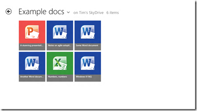
On my slate I only get two rows per screen:

image

You can set it to Detail view which gives nine rows on the desktop display and six rows on the slate.

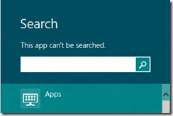
Touch-friendly, undoubtedly, but is this really best-practice design? What if you have lots of documents in a folder? I suppose it is just swipe-swipe-swipe, not helped by the fact that the SkyDrive app cannot be searched:

image

nor is there any way that I can see to sort the documents, say by last modified.

Of course you can do all these things in the touch-hostile desktop application.

Both the app and Windows 8 itself are pre-release so may improve, but I would like to see a smarter approach to browsing and selecting documents in Windows 8 Metro-style.

For more on Windows 8, see my review on The Register.

New Windows 8, new Visual Studio 2012

Microsoft has released the Release Candidate of Visual Studio 2012 (now the official name), which you can download here, to coincide with the release of Windows 8 Release Preview and Windows Server 2012 Release Preview.

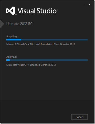
Visual Studio also has a new logo, as you can see from the setup window below.

image

Microsoft’s Jason Zander has posted about the new release here. Some of the main areas of difference between the RC and the Beta are:

  • Better performance
  • User interface tweaks including the return of a little more colour to the product
  • Solution Explorer filtering
  • New Metro style app templates
  • Improved XAML and Blend designers
  • Updated ASP.NET 4.5 web forms to support the await keyword
  • Tweaks to LightSwitch, Team Foundation Server, Architectural Tools

There is also a more detailed post by Scott Hanselman on what’s new in web development here.