I spent some time at the weekend working on a Bridge game for the Windows Store. I am writing it in XAML and C#. The UI is hardly demanding, given that Bridge is a card game, but it has made me take a fresh look at XAML, the markup language for a Windows Store App user interface (unless you use HTML and JavaScript). XAML is also used in Windows Presentation Foundation and in Silverlight/Windows Phone.
As part of the game, the user selects a “bid” which consists of a number from 1 to 7 and a suit of cards (or double, redouble or pass). Most bridge games show this as a grid though functionally it is like a combo-box (choosing from a pre-defined range of options).
Naturally I looked for the easiest way to accomplish this. The solution I came up with was to nest TextBlock controls in Border controls in Grid cells. Then I wrote C# code that detects which cell the user taps and updates the background of the selected Border accordingly.
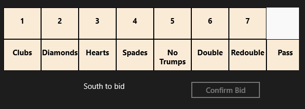
I have in mind to replace the text with graphics and make the numbers a bit smarter at some future date. My solution works fine; here it is at runtime:
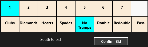
At the weekend I happened to be chatting with a developer more expert in XAML than myself, who told me I had done it wrong. In XAML everything should be in Style definitions. I should use a ListView and design it in Blend.
Well, I knew that I had somewhat subverted how XAML is meant to work, so I sat down to investigate this different approach. A ListView looks nothing like what I want out of the box.
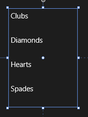
However, with the magic of XAML it can be transformed. I made the ListView horizontal by defining an ItemsPanelTemplate in Application.Resources:
<ItemsPanelTemplate x:Key="ItemsPanelTemplate1">
<StackPanel Orientation="Horizontal"/>
</ItemsPanelTemplate>
and adding
ItemsPanel="{StaticResource ItemsPanelTemplate1}
as an attribute of the ListView.
Then I added an ItemTemplate to draw the kind of block that I wanted:
<ListView.ItemTemplate>
<DataTemplate>
<Border BorderThickness="1" Height="130" Width="130" BorderBrush="Black">
<TextBlock FontSize="24" FontWeight="Bold" HorizontalAlignment="Center" VerticalAlignment="Center"
Text="{Binding Name}" Foreground="Black" />
</Border>
</DataTemplate>
</ListView.ItemTemplate>
Note that I am using a DataTemplate because the ListView is bound to an ObservableCollection in the proper XAML way.
At this point I am close to what I want – never mind that the numbers are missing, they can easily be added with a second ListView:
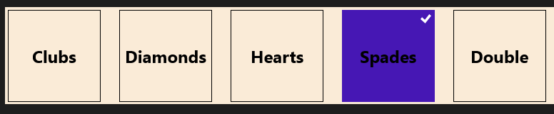
However I do not want that little tick mark appearing, the selected background colour is not to my taste, and the spacing of the items is wrong. How do I fix that?
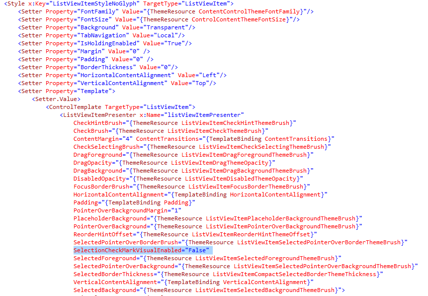
My search led me to this post which explains a far-from-obvious series of steps you can take in Blend. The steps did not quite work for me but got me on track to create a new Style resource which I called ListViewItemStyleNoGlyph and which lets me adjust the margin and also a previously hidden property called SelectionCheckMarkVisualEnabled. Blend generated a substantial block of code for this:
This has helped and now my ListView looks like this:
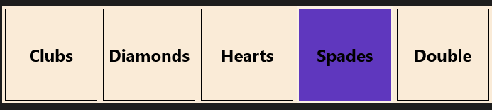
Well, it is nearly there and I can see that with a bit more effort I can get what I want. Even so, I am beginning to wonder whether my initial approach, in which I understood all the code, had advantages over this exploration into the labyrinth.
Is XAML well loved out there? I came across this post by Paul Stovell from a couple of years back which seems relevant. “I’ve lived and breathed the technology for the last six years”, he says, but writes:
What’s disappointing is that WPF started out quite positively during its time. Concepts like dependency properties, styles, templates, and the focus on data binding felt quite revolutionary when Avalon was announced.
Sadly, these good ideas, when put into practice, didn’t have great implementations. Dependency properties are terribly verbose, and could have done with some decent language support. Styles and templates were also verbose, and far more limited than CSS (when WPF shipped I imagined there would be a thousand websites offering high quality WPF themes, just like there are for HTML themes; but there aren’t, because it is hard).
Data binding in WPF generally Just Works, except when it doesn’t. Implementing
INotifyPropertyChangedstill takes way too much code. Data context is a great concept, except it totally breaks when dealing with items likeContextMenus.ICommandwas built to serve two masters; the WPF team who favored routed commands, and the Blend team who favored the command pattern, and ended up being a bad implementation for both.
Stovell mentions the verbosity of XAML, and that it is hard, both of which sound right to me. He contrasts the way ASP.NET has evolved, with ASP.NET MVC a great improvement on web forms. Read the full post for more detail.
It seems to me that XAML does offer much that is wonderful: flexibility, capability, and the ability to separate presentation from data. At the same time, neither XAML nor Blend are intuitive tools for developers; they may make more sense to designers, but it seems to me that removing a tick mark from a ListViewItem should be more straightforward. Perhaps it is, in which case there is a failure of documentation or tooling rather than functionality, but it makes little difference to the developer.