Category Archives: windows

Upgrading to Hyper-V Server 2012

After discovering that in-place upgrade of Windows Hyper-V Server 2008 R2 to the 2012 version is not possible, I set about the tedious task of exporting all the VMs from a Hyper-V Server box, installing Hyper-V Server 2012, and re-importing.

There are many reasons to upgrade, not least the irritation of being unable to manage the VMs from Windows 8. Hyper-V Manager in Windows 8 only works with Windows 8/Server 2012 VMs. It does seem to work the other way round: Hyper-V Manager in Windows 7 recognises the Server 2012 VMs successfully, though of course new features are not exposed.

The export and import has worked smoothly. A couple of observations:

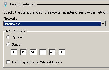
1. Before exporting, it pays to set the MAC address of virtual network cards to static:

image

The advantage is that the operating system will recognise it as the same NIC after the import.

2. Remove any snapshots before the export. In one case I had a machine with a snapshot and the import required me to delete the saved state.

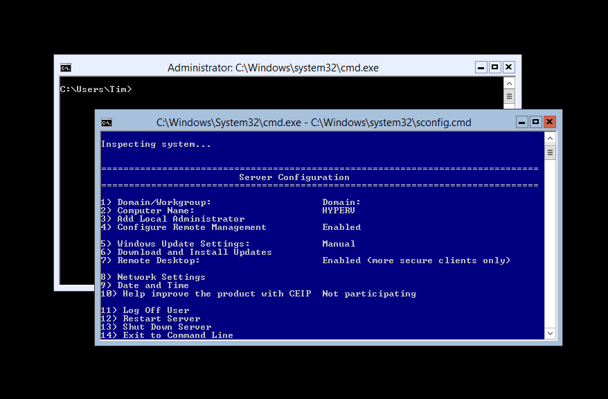
3. After installing Hyper-V 2012, don’t forget to check the date, time and time zone and adjust if necessary. You can do this from the sconfig menu.

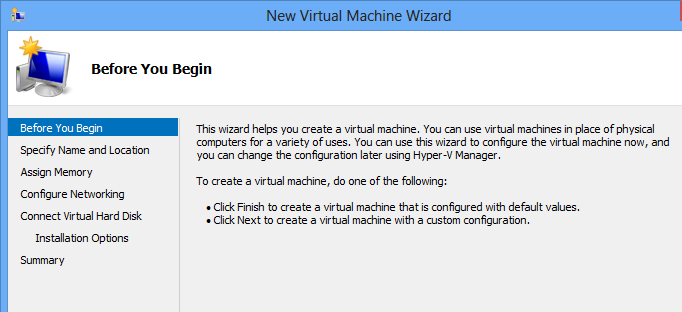
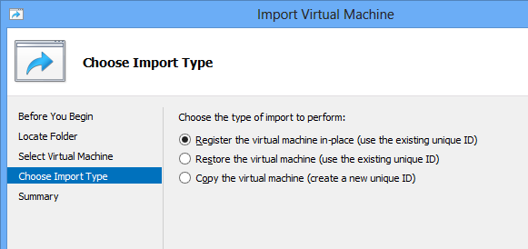
4. The import dialog has a new option, called Restore:

image

What is the difference between Register and Restore? Do not bother pressing F1, it will not tell you. Instead, check Ben Armstrong’s post here. If you choose Register, the VM will be activated where it is; not what you want if you mistakenly ran Import against a VM exported to a portable drive, for example. Restore on the other hand presents options in a further step for you to move the files to another location.

5. For some reason I got a remote procedure call failed message in Hyper-V Manager after importing a Linux VM, but then when I refreshed the console found that the import had succeeded.

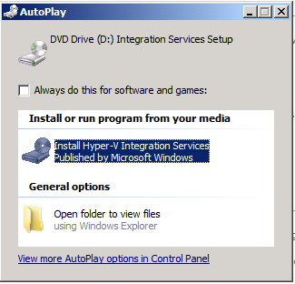
6. Don’t forget to upgrade the integration services. Connect to the server using the Hyper-V Manager, then choose Insert Integration Services Setup Disk from the Action menu.

image

Cosmetically the new Hyper-V Server looks almost identical to the old: you log in and see two command prompts, one empty and one running the SConfig administration menu.

Check the Hyper-V settings though and you see all the new settings, such as Enable Replication, Virtual SAN Manager, single-root IO virtualization (SR-IOV), extension support in a virtual switch, Live Migrations and Storage Migrations, and more.

No in-place upgrade for Hyper-V Server 2012

Microsoft’s free Hyper-V Server is a great bargain though I am beginning to think the company is pulling back on the idea. It is there for download; but the home page makes no mention of the fact that it is free, and the download page calls it trial software:

image

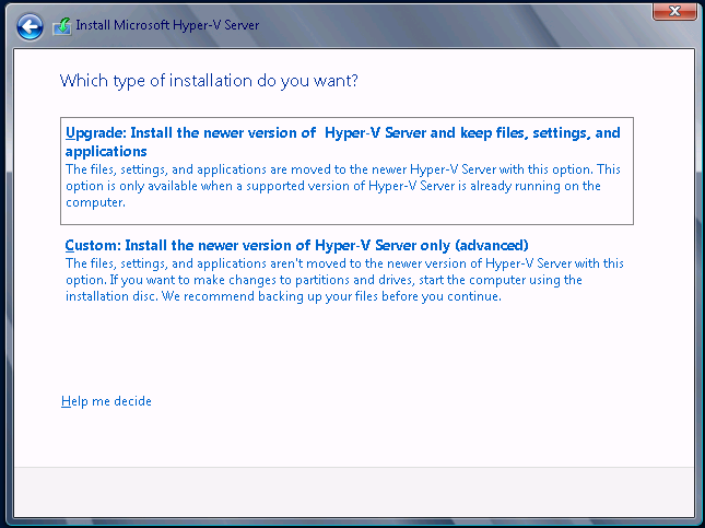
Further, support information for this specific edition is hard to come by. Here is one thing I discovered though: there is no in-place upgrade from Hyper-V Server 2008 R2, though the setup teases. This is what you get. First, an offer to upgrade in-place:

image

with the text, “This option is only available when a supported version of Hyper-V Server is already running on this computer”.

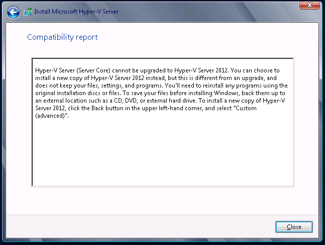
and then the bad news:

image

which in case you cannot read it says,  “Hyper-V Server (Server Core) cannot be upgraded to Hyper-V Server 2012”.

This document, which covers in-place upgrade options for Server 2012, does not even mention Hyper-V Server. It does say this about Server Core, on which Hyper-V Server is based:

Upgrades that switch from a Server Core installation to the Server with a GUI mode of Windows Server 2012 in one step (and vice versa) are not supported. However, after upgrade is complete, Windows Server 2012 allows you to switch freely between Server Core and Server with a GUI modes.

Note that it says “in one step”, suggesting that an upgrade from Server Core to Sever Core should work; then you can add the GUI later if you want. In the case of Hyper-V Server, there is no GUI option anyway; so you would have thought it should be OK. Given the lack of attention to this edition generally though, I wonder if it is a victim of “it’s the free version, let’s not bother".

Incidentally, in-place upgrade from Hyper-V Server 2008 to Hyper-V Server 2008 R2 worked fine.

Windows 8 desktop user tip: learn mouse-top-left-drag-down

Windows 8 is a difficult adjustment for some users, particularly those with long experience of earlier versions. With its dual personality it is always going to be a little odd; but I have found it just as productive as Windows 7 for desktop use. In fact, thanks to its good performance and other new features, I prefer it.

Some actions in Windows 8 are not obvious though, hence the puzzlement of first-time users staring at the desktop and wondering how to get back to the Start screen.

There is one mouse movement in Windows which I find particularly useful, which is mouse to top left corner and drag down. This works in both the Desktop and Modern UI (“Metro), provided that at least one Modern UI app is running. It displays a list of all running Modern UI apps, with the one you last used (before the current app) at the top.

image

This is an app switcher, and I use it frequently to get back to the desktop from a Modern UI app in one quick mouse movement. However it has other functions too. If you right-click an app in the list, a close button appears. If you have a screen wide enough to support Snap, you can also snap the app to left or right.

image

You can also activate Snap by click-and-drag on an app in the list. Just drag it a little to the right. When you release the mouse, it will be snapped left. Or drag it all the way to the right to snap there. Or if the screen is already in a split view, drag it to the centre of the screen to replace the current occupant.

Gadget Writing: some posts you may have missed

There are two sites at ITWriting.com and if you follow the RSS feed for this one you may have missed the posts at the other. This site covers software development and IT admin topics, while Gadget Writing covers mobile devices, audio, general software tips and reviews, and in general has a more consumer flavour.

Among the popular posts is the Desktop Windows 8 survival guide which is a guide to those awkward issues you will encounter when using Windows 8 on a traditional keyboard and mouse PC rather than a tablet. This has been considerably updated and expanded from its first version.

Gadget Writing has its own RSS feed which is here.

Here are some other recent posts:

This may be why your computer is crashing

I was asked to look at a PC which was misbehaving. Sometimes it worked, but increasingly it was freezing or crashing. Sometimes the hard drive would corrupt and needed Windows repair before it would boot. I took a look. I … Continue reading →

Review: Audyssey Lower East Side Audio Dock Air for Apple AirPlay

Based in Los Angeles, Audyssey specialises in audio processing software. This is used in home theatre equipment such as multi-channel receivers, and also finds its way into TVs, mobile devices and cars. In 2010 Audyssey started making its own audio … Continue reading →

Farewell to the Squeezebox

It looks as if Logitech has discontinued the Squeezebox, a range of devices for playing music streamed from the free Logitech Media Server. Logitech also runs a streaming service on the internet, Mysqueezebox.com, which supports internet radio, Spotify integration and … Continue reading →

The one thing missing from Windows 8 tablets announced so far: simplicity

This week at IFA in Berlin PC manufacturers have been showing off their shiny new Windows 8 tablets. Vendors are competing for who has the cleverest way of combining touch-screen, tablet, trackpad and keyboard into a single portable device. Here … Continue reading →

Free competition: Win a Kingston DataTraveler Locker+ secure USB Flash Drive

Ever worry about exposing confidential data by losing a USB Flash drive? Easy to do; but worry no more. A DataTraveler Locker+ secure drive is password protected, and after 10 failed attempts the data is wiped. Read our full review … Continue reading →

Understanding Windows 8 Storage Spaces: confusing but powerful

Early users have been running into trouble with Windows 8 Storage Spaces. The same technology is used in Server 2012. I posted about the issues here. Storage Spaces is a way of virtualising disk drives. You manage physical drives in … Continue reading →

Review: Kingston DataTraveler Locker+G2 secure USB Flash drive

Ever lost a USB Flash drive? Do you even know? There are so many around now that it would be easy to drop one and not to notice. Most of the time that does not matter; but what if there … Continue reading →

Review: Dragon NaturallySpeaking 12. Stunning accuracy, a few annoyances

I am writing this review, or should I say dictating, in Nuance’s Dragon NaturallySpeaking 12, the latest version of what is in my experience the most accurate speech recognition system out there. Accuracy has got to the point where the … Continue reading →

Understanding Windows 8 Storage Spaces: confusing but powerful

Early users have been running into trouble with Windows 8 Storage Spaces. The same technology is used in Server 2012. I posted about the issues here.

Storage Spaces is a way of virtualising disk drives. You manage physical drives in a pool of storage, and allocate virtual drives from that pool. The virtual drives can be bigger than the actual space available; this is called “thin provisioning”. When you are running out of physical space, you can add additional drives.

It sounds great and it probably is (I am reserving judgement to some extent depending on long-term reports from the field) but it can be confusing, especially if you use Parity for resilience. This user setup a Parity space with three drives, 1TB, 2TB and 320GB. Storage Spaces told him that 2TB would be available (less than the total capacity because it is resilient against drive failure). However the space was exhausted at less than 1TB. Worse still, at this point the drive vanished from his system.

This is all working as designed, though it seems to me that there is plenty of potential for confusion. Here is how I understand it.

1. A Parity space writes data over three or more drives. Therefore, if you only have three drives available, it will be unable to add more data once the smallest drive is full. One small and two large drives is a bad case for a Parity space. It is better either to have four or more drives, or else drives of equal size.

An alternative is to use a mirrored space. This works by duplicating data on two drives. In the example, that should yield 1TB + 320GB of space by mirroring the data on the 2TB drive – more than was available with Parity. With a larger number of drives though, or equally sized drives, Parity is more efficient.

2. When the storage space is full, Windows takes it offline. This is to protect your data. Once you have fixed the problem by adding more drives, you can bring the space online again.

What if you have no drives handy and you NEED access to your data? You try bringing the space online, but Windows immediately takes it back offline because the error condition still exists (and Windows or its applications can be chatty about writing data).

The solution is to mark the space as read-only which you do with PowerShell. Then you can bring it back online and access your files.

Why so confusing?

Storage spaces comes from the server team and is also available in Windows 8. It is possible that the management interface is less helpful than it could be because of that, on the grounds that IT admins are more willing to plough through documentation.

For example, it would be helpful if the spaces manager would calculate the actual capacity available with the currently attached drives and the selected resilience, and tell you that, rather than giving a nominal figure which means “this is the space which these drives can provide though you might have to add more drives to make use of it all”.

Next, there is the question of alerts. The Windows Action Center should alert you if the space is nearly full. However the value of the notification area in Windows was reduced when the Windows 7 team decided to hide most notifications by default, thanks to abuse of the system by third-party software.

Incidentally I always set the notification area to Always show all icons and notifications. If I don’t like a third-party notification, I remove the application or prevent it from running automatically. Right-click the notification area and choose Customize notification icons to make this change.

image

Returning to storage spaces, I have seen several users say they did not see alerts which suggests they are not tuned quite correctly; or maybe users are just in the habit of ignoring notifications.

Third, why doesn’t Windows mark full spaces as read-only when full, instead of taking them offline? Vanishing drives are unsettling for users. Make them read-only would be easier to understand. My space is full – I cannot add more data.

Further reading

Detailed MSDN article about Storage Spaces

Post by Darren Moss with PowerShell examples for taking a space read-only or offline/online. Darren Moss is a Senior Program Manager at Microsoft.

Guest post with a view from the enterprise: Microsoft is getting it right with Windows 8

The following is a guest post from a contact who holds a senior IT role in the finance industry.

image

I think Microsoft is getting it right. I don’t recall saying this about anything they have done before, which makes this a matter of some significance to me. My view on W8 is that it is a purely transitional state to a brave new world and that a number of strategic concerns are driving W8’s capabilities. Here’s what I think is going on:

1. MS thinks the the PC is over.

Well, that may be a bit extreme, perhaps it would be better to say that given MS’s dominant position, the PC will be over before anyone can take it away from them, so now is the time to maximise the cash being extracted from this cow by minimizing the investment.

The implication is that computing is heading in 2 directions – ‘down’ to phones and tablets and ‘up’ to the cloud. MS is trying in the cloud space, if not perhaps succeeding brilliantly. In the phone/tablet space

W8 is (at least potentially) a serious contender to iOS.

2. MS loves enterprises (and people who sometimes look like them, e.g. educational organizations)

Office is where MS’s money is coming from. Office is the (only?) reason the W8 has a legacy desktop. This enables corporates (many of whom won’t take W8, but there had to be a story for them) and educational users to upgrade while staying with Office.

Also, notably, Apple is conspicuous for sticking to the mass retail market. This is making a number of tricky issues for enterprises such as mine when it comes to developing corporate mobile applications on iOS.

3. MS is taking good UI chances

This is a big one. Apple has always had good old WIMP GUI right. In the new world they have opened in iOS, the UI, while easy to use, is fundamentally application-centric. In fact the iOS home view of app icons is scarily reminiscent of the Windows 3.x Program Manager.

The W8 ‘modern’ UI with its active tile concept provides something that opens up the possibility of a task-oriented UI. This could be a huge benefit to enterprises and is, at least, a good marketing angle for MS.

4. Corporate users could be excellent gateway users

What if every corporate BlackBerry user wanted to get rid of Blackberry Enterprise Server? oh – they do :-). What’s the alternative? Nothing from Apple (and no sign of anything coming). a huge slice of those corporates already use Exchange (must be 99+%). What if MS was able to offer secure mobile device management with a modern UI platform? Looks like a good way of capturing a lot of that market. Think of all those corporate mobile users with a W8 phone – MS gets to bypass head-to-head competition with Apple for this slice of the market. How many people bought Windows PCs because they had to learn Windows at the office? ok, maybe not a huge number, but it’s not a bad (affluent) group to use as the basis of chipping away at Apple mind-share.

5. What if those corporates were looking to replace PCs both real and virtualized) with tablets?

It’s already the case that an iPad can do anything that the vast majority of enterprise users do with their PC (once you include VPN desktop access). Put office on the device (with cloud storage) and an enterprise can be shown a way to make massive reduction in desktop PC costs. The only compelling reasons for another type of device are software development and large UI footprint (multi-monitor). The MS Surface offers the possibility of a device that:

  • looks like your new corporate mobile device
  • can do everything (including Office) that your PC can do
  • is at a much lower price point

so that’s my view in the crystal ball. If MS were thinking that the PC was dead and wanted to avoid a (probably losing) head-on fight with Apple, their entrenched position in the enterprise looks like their best starting point. Offering enterprises a possible post-PC future with unified mobile and desktop UX based on Windows phones and tablets with Azure or private cloud back-end looks like it might be a strategy. the coming (already started) implosion of RIM looks like an opportunity for Windows phone to kick-start the adoption process.

What would W8 look like if this was what MS was thinking?

  • it would have a modern UI, distinctly different from Apple’s, not being WIMP-like
  • it would be NOW, to help point to a future enterprise based on W phones and tablets to help capture the RIM refugees.
  • it must contain Office, at all costs to sustain the enterprise story

oh look, that’s what W8 is like. So, for all the noise around how nasty W8 is, I think it’s indistinguishable from what it would be like if MS really had a plan that might work. The inelegant dual-UI can be thought of as a consequence of the need for a migration path for existing apps, a recognition that all those office users are starting out on PCs and (possibly) that they couldn’t engineer a real modern UI office in time.

The final irony is that Vista may turn out to be the biggest boost for this strategy. Major enterprises that I have seen have generally moved their desktop fleet onto every second (or more) big Windows release.

Nobody moved to Vista, those who were due to move held off because it was so awful. Everybody went (and most are still in the process of going to) Windows 7. As a result, none of the enterprise customers have to actually implement W8 for their desktop fleet – they just have to drink MS’s Kool-Aid for the future and be able to use W8 phones and tablets, where most of the ugliness disappears.

Uh-oh, here come the OEM improvements to Windows 8

Reports from a Samsung event today indicate that the company is implementing its own version of the Windows 7 Start menu, which it calls the S Launcher.

The all-in-one PCs Samsung unveiled this morning are the first Windows machines to sport the S Launcher, a simple widget that acts just like the old start button: Click, start typing (say “keyboard”) and it instantly shows you the settings and apps that relate to your term. There’s also a separate settings icon for quick access to the most commonly needed controls.

On the face of it that sounds like a good move. The general reaction to the removal of the Start button in Windows 8 has been mixed at best. Why not put something like it back?

It is hard for Microsoft to object to this. The official line is the Microsoft’s partners add value to Windows with customization and software unique to each vendor, enabling them to differentiate. There is also the matter of fees paid by third-parties such as browser or security software vendors, to pre-install their stuff and win lucrative traffic or subscriptions.

This is a big one though. Microsoft must care about its new Start menu, to have resisted all pleas from its customers to reinstate the old-style version as an option.

It is also obvious that this is not just about usability. The Start screen is the gateway to the new Windows: Modern UI, Windows Store, tie-in with Windows Phone, Windows Tablets and Xbox, and more.

Here it gets interesting. Although Microsoft and Samsung are both selling Windows, the objectives of the two companies are not altogether aligned. Samsung is a big Android vendor; and even within the Android world, it is promoting Galaxy as a brand and links to its televisions. Samsung also sells Windows Phone, but you would hardly know it.

You can think of it as two separate ecosystems, one based around Windows and Microsoft, the other based around Samsung, which happen to intersect in the area of desktop operating systems.

Samsung then does not care whether the Modern UI, Windows Store and Windows Phone are hits. In fact, when it comes to Windows Store and Windows Phone, it may prefer that they fail.

It is not even that simple. If the Microsoft and Windows ecosystem continues to decline, who can take on Apple? It is in Samsung’s interests as an OEM Windows vendor for Microsoft to succeed, as the same time as other parts of its business would prefer that it fails. Complex.

If nothing else, the S-launcher show how little Microsoft and its hardware partners are aligned when it comes to Windows marketing strategy.

What about the users though? Will they not benefit from having a more familiar way to launch their applications? Personally I doubt it. The problem I have with utilities like this is that they break the design work Microsoft puts into Windows, introducing inconsistency and often working less well than what is baked into the operating system.

I will add too that the Windows 8 Start screen is actually not the monster it is made out to be. It is richer than the old one, with its Live Tiles and large icons, and once you have learned how to organise it in the way you want, it is an effective launch manager. The fast incremental search in the Start screen works brilliantly.

It would benefit Samsung’s users more if the company focused on helping them learn how to get the best from Windows 8 and its new user interface, rather than encouraging them to avoid some of its key features.

Now you know why Microsoft is doing Surface and the Microsoft Store with its Signature PCs, tweaked (or untweaked) to run as designed.

Developing for the Windows Runtime: a few more notes from the field

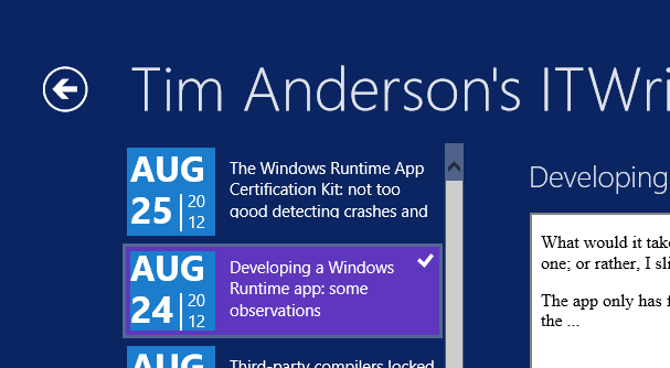
I have been poking around in the code for my Windows Runtime ITWriting.com reader, which is based on this MSDN sample. The list of posts looks like this:

image

Not bad, but that block showing the date of each post is based on Windows Team Blog page, which is nothing to do with me. What would it take to modify the design?

The problem with sample code is that when you copy and paste you do not really know how the code works, and sometimes issues are hidden. The MSDN article, while it does a good job explaining most parts of the app, does not explain how the date block is put together. A few observations then from my efforts to modify this.

Most of the code for this date block is in the ResourceDictionary element in App.xaml, which means it can easily be reused on multiple pages. The code is a ControlTemplate element, which means it defines a custom control. This is then referenced within a DataTemplate element on the pages where it appears. The DataTemplate defines how the bound data appears in the list.

Reading a block of XAML and trying to visualise how it will render is not much easier than viewing a photo in a binary editor. However, you cannot view App.xaml in a visual designer, since it is not a visual page. The only solution I could think of was to copy the ControlTemplate out of App.xaml into a page where I could see the design, tweaking it, and then copying it back.

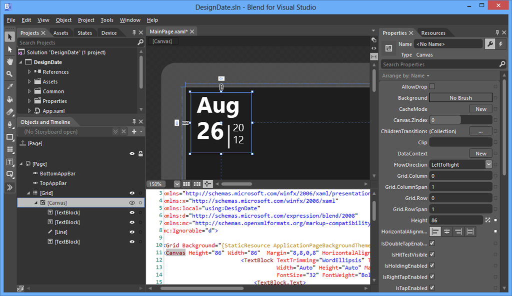
I started a new project in Blend, and copied the Canvas code from the DateBlockTemplate, and replaced the data bound values with hard-coded examples. So far so good: I could now tweak the design.

image

My design skills are rubbish so I ended up with a simpler layout. In my adaption, the month and day appear on one line, as in “Aug 26”.

This led me to another problem. In the sample, the month and day are bound as separate fields, for example:

<TextBlock.Text>
<Binding Path="PubDate" Converter="{StaticResource dateConverter}" ConverterParameter="month"  />
</TextBlock.Text>

How could I concatenate the two bindings to appear in one TextBlock? In Windows Presentation Foundation (WPF) you can do this with the MultiBinding class, but this did not seem to work in WinRT XAML. Rather than go further down that route, I decided to amend the DateConverter class which is also part of the sample, to add a conversion that returns both the month and the day.

DateConverter.cs users the new DateTimeFormatter class.  The documentation explains that this takes a “format template string” but does not offer a reference for constructing formats. I experimented and ended up with:

DateTimeFormatter dateFormatter = new DateTimeFormatter("{month.abbreviated(3)} {day.integer(2)}");

which turns out to work.

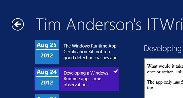
Now my list of posts looks like this:

image

Not as stylish as before, but at least it is different.

The Windows Runtime App Certification Kit: not too good detecting crashes and hangs

Now that I have a lovely ITWriting.com App I thought I should check out whether it is ready to fly.

I therefore ran the App Certification Kit that installs with Visual Studio 2012.

image

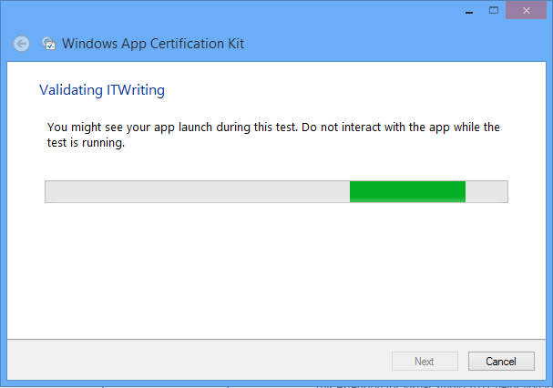
The tool asks you to select an installed app and then exercises it. I saw my app open, though I did not see it get beyond the first screen.

image

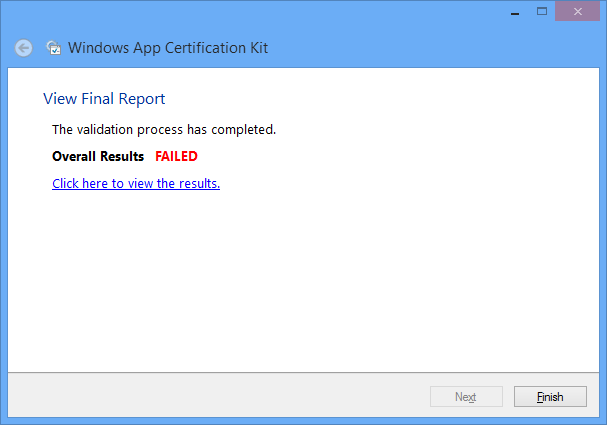
Eventually – bad news:

image

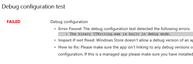
However, there is only one thing wrong with it:

image

Yes, the version installed is the debug build. I can fix this simply by rebuilding in release configuration.

What does the Kit test? Here is the list:

  • Crashes and hangs test
  • App manifest compliance test
  • Windows security features test
  • Supported API test
  • Performance test
  • App manifest resources test
  • Debug configuration test
  • File encoding
  • Direct3D feature level support
  • App Capabilities test
  • Windows Runtime metadata validation

That sounds most impressive and makes a great list for you to show to your customer.

I am sceptical though. If the app was not exercised beyond the opening screen, might it not be a bit buggy after all?

I inserted the following line of code into the the Click event handler for reading a blog:

int iCrash = 1 / string.Empty.Length;

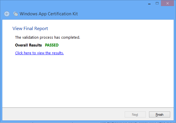
I then rebuilt the app in release mode and ran the App Certification Test. Great news!

image

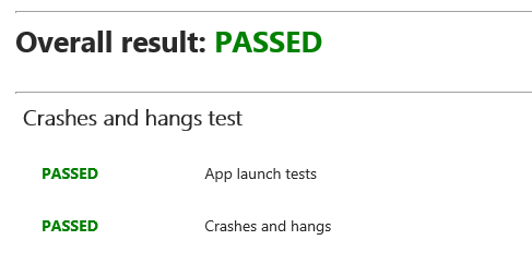
and specifically:

image

Thanks though to my umm, bug-unfix, the app crashes whenever I click to read a blog.

I mention this not to poke fun at the App Certification Kit, but to observe that it does not do a good job of automatically detecting crashes and hangs.

The implication is that the human testers are the ones who will do this before an app is admitted to the store. I think they would find my obvious bug; but how much time will they have to test every feature of an app?

Developing a Windows Runtime app: some observations

What would it take to create a Windows 8 Modern UI content reader for this site? Just for fun, I built a simple one; or rather, I slightly adapted Microsoft’s Metro style blog reader tutorial.

The app only has four screens (or pages) but despite its simplicity I found the tutorial somewhat fiddly. Getting the data from the WordPress RSS feed is simple, thanks to the Windows.Web.Syndication namespace which is part of .NET Framework 4.5. Most of the work is in the user interface, which means switching between XAML and C#. Of course as a developer I would rather work in C#.

Further, the Visual Studio editor for C# is better than the editor for XAML. In C# I can easily navigate the code using Go to Definition, Find all References, and so on.  In XAML it takes longer to find things like referenced styles and resources. Plus XAML is XML, which I find harder to read than an elegant language like C#. Even commenting out a line is more hassle in XML.

I did not like the colours used by the tutorial for the list of posts in SplitePage.xaml. It took me a while to work out what to change. Was the colour defined in a resource, or in a template, or in a style, or directly coded as an attribute of the relevant TextBlock object?

Of course you can open the XAML in Blend if you prefer, the designer-oriented tool that comes with Visual Studio 2012. Blend is more complex than the Visual Studio XAML editor, but may be better once you have figured out how it works.

The amount of work involved in making your app well-behaved is proportionately larger if your app is essentially very simple. You have to deal with different layouts for different screen sizes and orientation, as well as the small Snapped layout. You also have to consider what happens if your app is suspended and resumed.

The above means that despite the apparent simplicity of a Modern UI interface, with its chunky buttons, there is more to consider than with, say, a Windows Forms application whose window is never rotated and over which you have full control.

Still, I was pleased with my app which has reasonable functionality based on a small amount of work.

Visual Studio 2012 is impressive, though I did experience some screen corruption after switching back and forth between the Metro and Visual Studio environments for debugging. Restarting Visual Studio fixes it. Using the simulator seems more robust in this respect.

image

The App Bar

One thing though. If you squint at the above screenshot, you will see that I have put a Read button to the right of the post title. Clicking or tapping this opens the post in a embedded web browser view that is nearly full-screen. However, this Read button is not included in the tutorial, which says:

On the split page, we must provide a way for the user to go to the detail view of the blog post. We could put a button somewhere on the page, but that would distract from the core app experience, which is reading. Instead, we put the button in an app bar that’s hidden until the user needs it.

This may in fact be an excuse to include an App Bar in the tutorial; but I disagree with it. With the App Bar, the user has to right-click or swipe down to display the App Bar, and then click or tap the View Web Page button.

image

That is two actions rather than one. Is it really better than having a small button in the UI?

It seems to me that tucking things into the App Bar is fine in cases where there is real merit in an immersive experience, such as in the web browser, but less compelling when you already have a screen with a back button and a scrollable list. I was also concerned that users might not realise they needed to display the App Bar in order to use the app properly.

Let the design debate continue.

Design-centric

Microsoft’s Modern UI continues a trend which began with Windows Presentation Foundation (the first incarnation of XAML), which is to make a platform richer for UI designers and more challenging for developers who lack design skills. Nothing wrong with that; but if you remember how easy it was to snap together an app in Visual Basic 3.0, you may feel that something has been lost.

I guess that recognition of that fact was one of the motivations behind Visual Studio LightSwitch, in which you define the data and business rules, but the screens are generated for you. LightSwitch has complexities of its own though.